GIGALERT
User Interface - Designing a UI Library for a Mobile App
An app that curates concerts and events based on your playlist, location and mood.
OVERVIEW
In the User Interface Design world, a UI Library (a.k.a. visual styles, or theme) is a custom graphical interface elements package that is applied to a particular app or website to create an elegant experience for the users. Creating a library enables teams to collaborate more efficiently and makes it easy to create consistency throughout the entire experience. The ideation, creation and execution of a well crafted UI Library has a huge impact on how an app is received by the user. It can be what makes or breaks the success of a product.
TIMELINE
1 week
PLATFORMS
Mobile Device
ROLE
Lead UI Designer
TOOLS
Sketch, Photoshop, InVision
DESIGN METHODS
Design Inception, Visual Language (Mood, Colour, Shapes, Movement), Moodboard, Art Direction, Style Tiles, Style/Brand Guide, Iconography, Typography, Logo Design
THE CHALLENGE
KEY DELIVERABLES
GigAlert is an app that curates concerts and events based on your playlist, location and mood. The goal is to create an engaging, impactful and well-designed UI Library and apply it to the supplied wireframes, research and information of my specific application and target audience.
FEATURE REQUIREMENTS
• Develop a moodboard and style tile documents
• Creating a coherent colour palette
• Typesetting & pairing
• Layout composition for apps
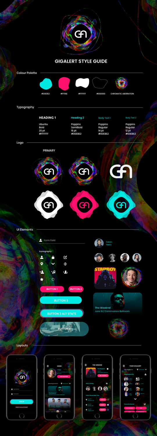
• Creating a style guide document
THE SOLUTION
DESIGN INCEPTION
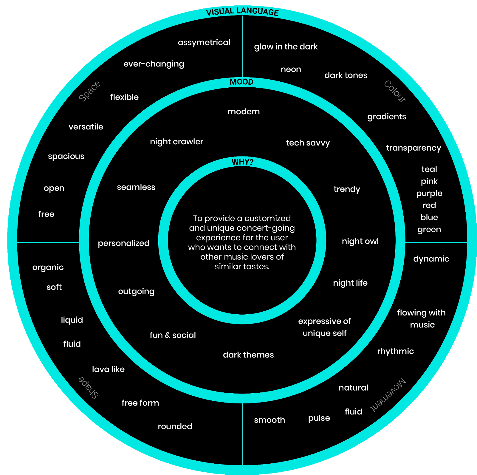
The app provides a very customized and unique concert-going experience for the user because, as mentioned above, the app curates events based on the many personal factors including location, favourite genres, favoruite songs, favourite artists, and even current mood.
And because the user’s profile is so unique, there is an opportunity to allow like-minded people to connect who share the same unique tastes in music/events to celebrate and appreciate music/concerts/art together.
The ultimate “why” is: To provide a customized and unique concert-going experience for the user who wants to connect with other music lovers of similar tastes, and ultimately, to create a sense of community and belonging.
MOODBOARD
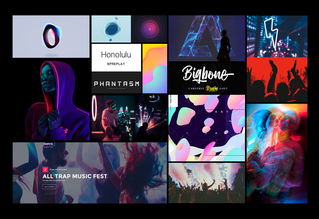
The words I would use to describe the app are: modern, slick, nightlife, dark themes, fun, social, connection, self-expressive and artistic, emphasis on unique self and individuality because of the app’s function to curate events based on the user’s personal preferences.
I imagined the user who will use this app is a night owl, who is outgoing, tech-savvy, loves go to town to have fun, party, socialize, and enjoy music and concerts.
CHROMATIC ABERRATION
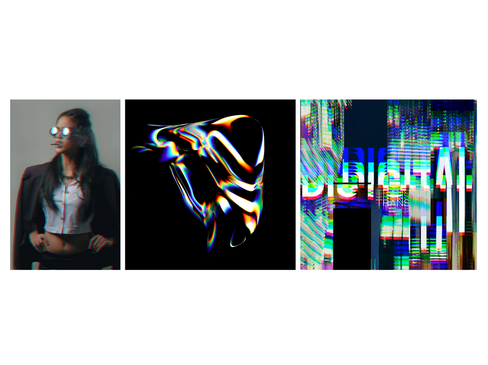
For the logo and background pattern elements, I wanted to go for a special visual design resembling soap bubbles. I experimented with the photographic effect called “chromatic aberration” on Photoshop. My design inspiration came from creative research of chromatic aberration effects and colour schemes which I wanted to incorporate in my design.
WIREFRAMES
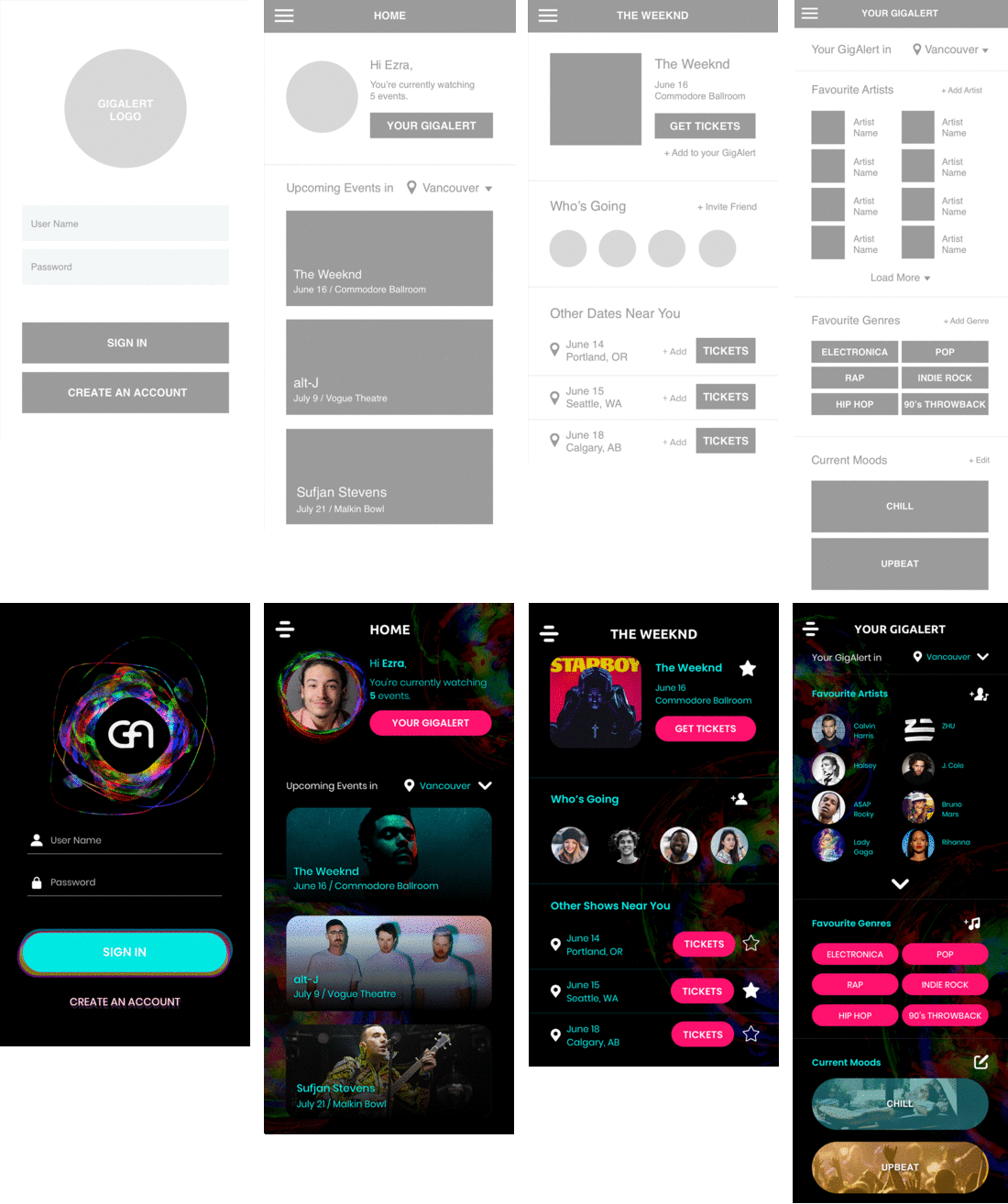
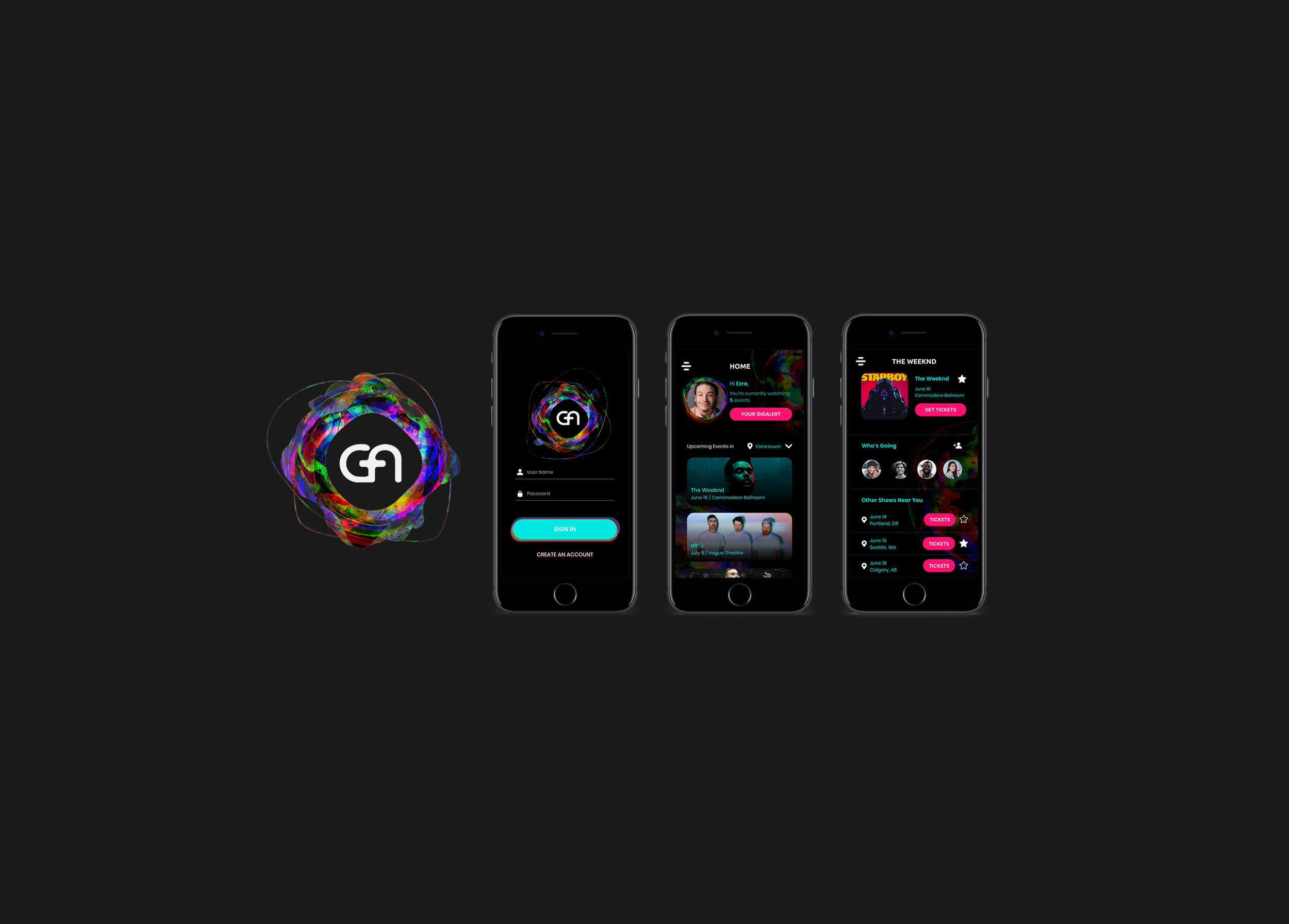
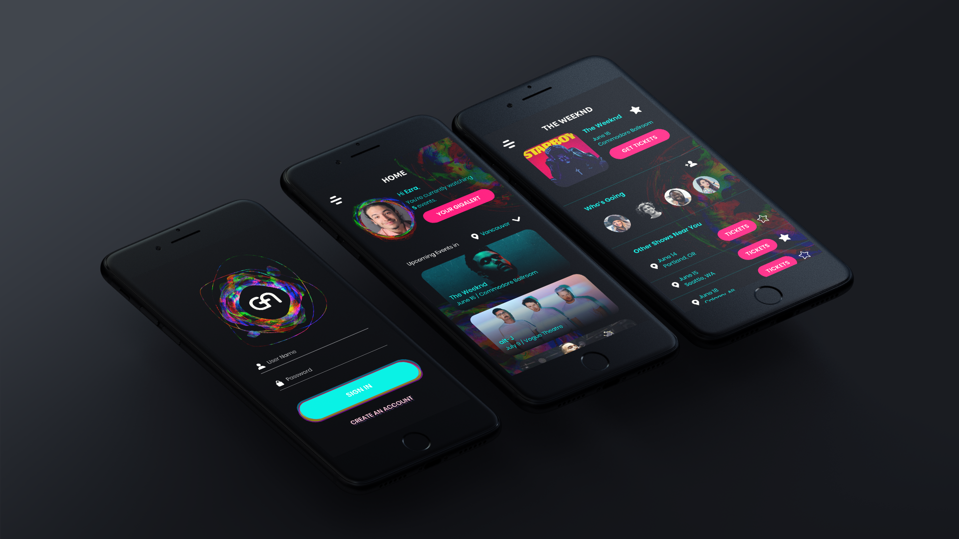
Medium Fidelity wireframes provided to me and the final high fidelity wireframes I created.