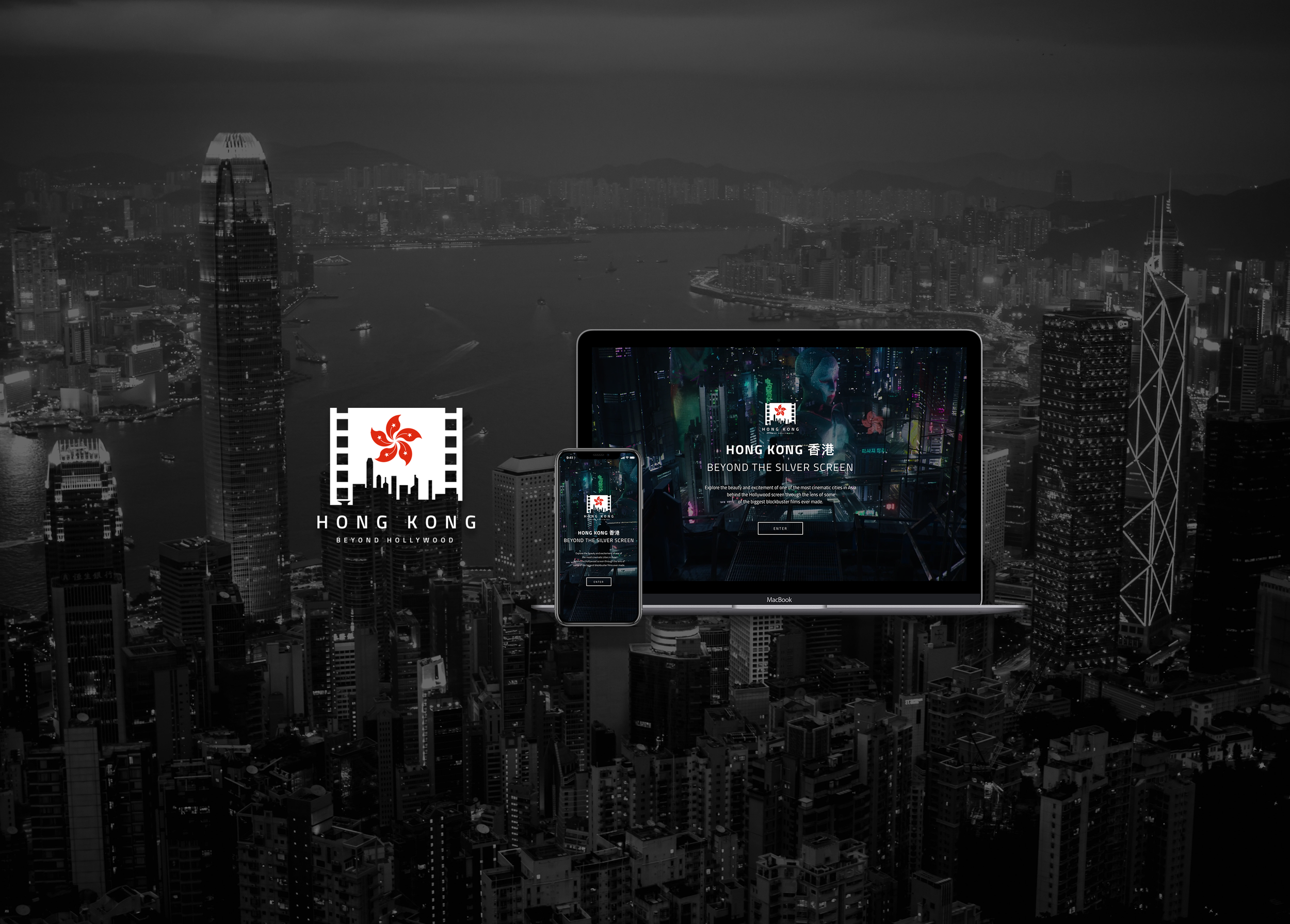
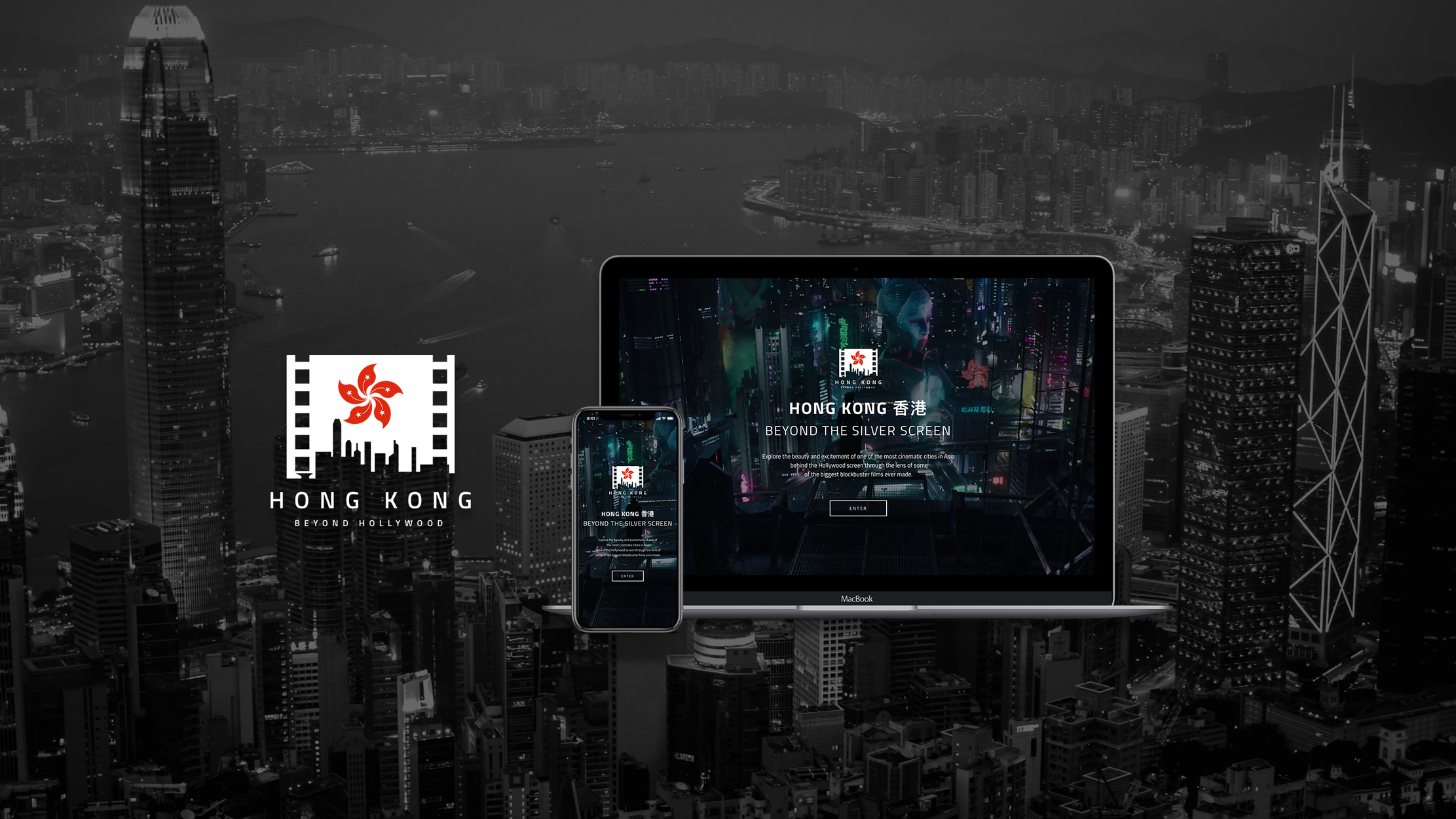
HONG KONG: BEYOND HOLLYWOOD
User Interface Design (UI) - Tourism Campaign
"Explore the beauty and excitement of one of the most cinematic cities in Asia through the lens of some of the biggest blockbuster films ever made."
OVERVIEW
The travel and tourism industry is one of the world’s largest and fastest growing industries with a global economic contribution of almost 7.6 trillion U.S. dollars in 2014. Countries recognize the exponential benefits in their economies by boosting their tourism efforts. At the same time, it also serves as a great platform for them to establish their own brand identity and place in the world. The digital era has only upped the ante on this competitive and high stakes industry. Today, designers have more at their arsenal in creating experiences and showcasing their country even before they step into the airport. In spite of all the bells and whistles digital media has to offer, the foundations of great brand identities remain the same. The visual communication, impact and design of a website can either make or break that positive and strong first impression of your brand. Now more than ever, merging meaningful content with experiential design stand as one of the biggest challenges for designers.
TIMELINE:
3 weeks
PLATFORMS:
Desktop and Mobile Device
ROLE:
Lead UI Designer
DESIGN TOOLS / METHODS:
Sketch, Photoshop, InVision, Principle for Mac, QuickTime Player, VLC Player
Design Inception, Visual Language (Mood, Colour, Shapes, Movement), Moodboard, Art Direction, Style Tiles, Style/Brand Guide, Iconography, Typography, Logo Design, Marketing Campaigning
THE CHALLENGE
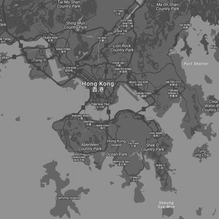
Key deliverables
1. Build an engaging and impactful brand campaign that promotes tourism on the country/area and target audience you selected.
2. Create a strong visual brand identity and a responsive website creating engaging, impactful and well designed experience for the users and optimized to meet business goals. (create 2 initial art directions and follow through with one of them; deliver a style guide in terms of: Logo, Typography, Colours, Imagery/ Photography.)
3. Establish a consistent visual identity that carries through different marketing and promotional materials. (social media and display ads, and application of my visual brand identity in the form of: iconography, interactions, animation, T-shirts, other swag, printed or digital collaterals.)
4. Create a logo for the campaign that captures the direction, mood, tone and audience you will be capturing.
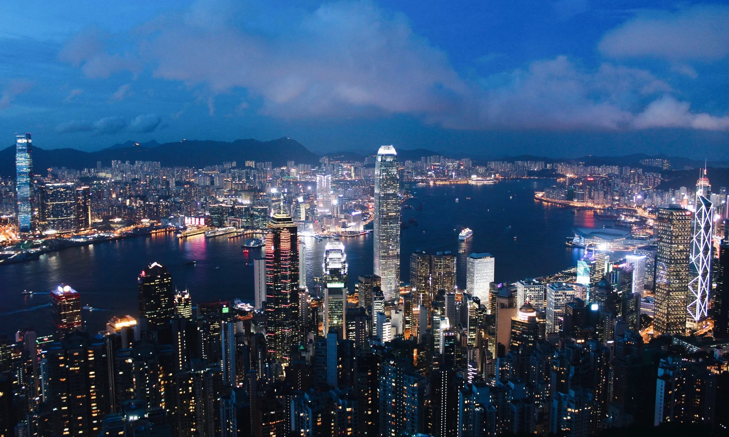
Hong Kong and Movies
I chose Hong Kong as it is a vibrant city both day and night it; has a mix of both old and new, traditional and modern, and a mix of Chinese and Western culture. HK is both an international financial centre and also one of the most popular Hollywood film locations in the world. I want to bring HK to an international level and bring the East to the West. I want to showcase Hong Kong through a different lens, i.e. through the lens of different major Hollywood blockbusters.
RESEARCH & DESIGN INCEPTION
Target Audience
My target audience are movie buffs/fans /enthusiasts, frequent movie goers who are mostly Caucasians and Hispanics aged 25 to 39. They are both male and female and they watch about 4–7 movies a year. [data based on North American MPAA (US/Canada) statistics]
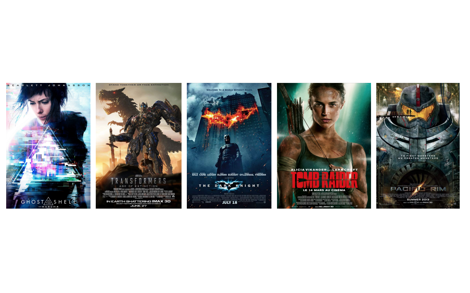
FEATURED FILMS SHOT IN H.K.
I recorded, trimmed, merged, and edited clips selected from different movies that had scenes that were shot in Hong Kong. Movies I picked were famous and more recent Hollywood blockbusters that are familiar to my target audience, including:
Ghost in the Shell (2017), Transformers: Age of Extinction (2014), The Dark Knight (2008), Tomb Raider (2018), Pacific Rim (2013).
Art Direction 1: Hong Kong by Day. Traditional, Charming, Serene.
Art Direction 2: Hong Kong by Night. Modern, Edgy, Cinematic.
MOODBOARDS
Art Direction 2 is the one I have chosen to move forward with. It's edgy, modern, sleek, cinematic and emanates a widescreen experience. It is scenic, picturesque, highly visual and impactful, epic, exciting & thrilling, action-packed, adventurous and immersive. This mood is more heavy with lots of cinematic footage and photos that have dark filter overlays to mimic the cinematic screen. It also feels like it is a night time exploration of Hong Kong and this city that never sleeps is known for it’s awesome night life.
STYLE TILE ITERATIONS
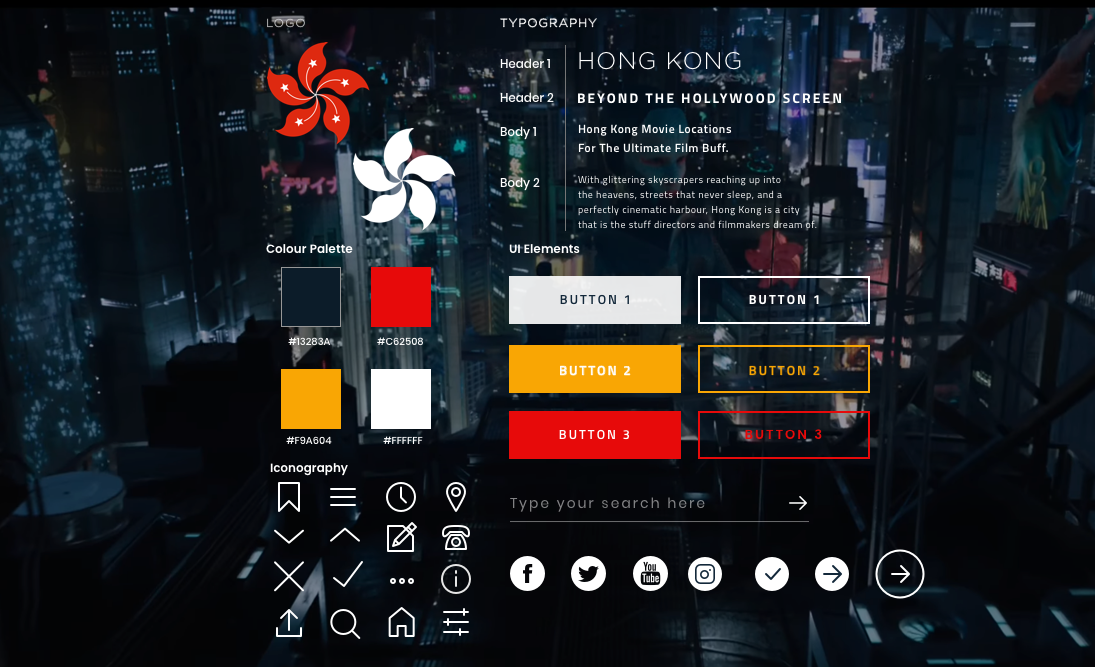
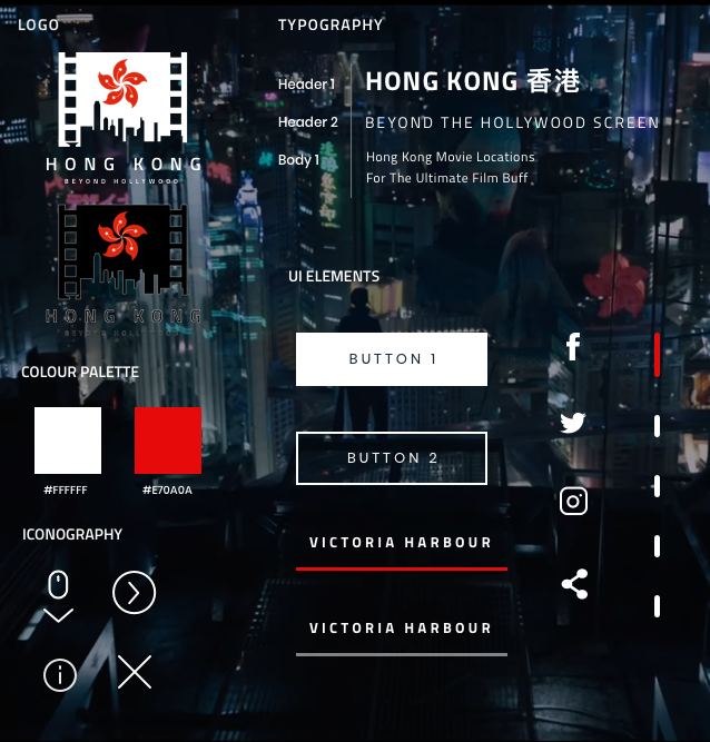
I started off with four colours and two different typefaces for the header and body, Gotham and Titillium Web. In the final style tiles below, I simplified the colour palette down to just two colours. I did this in order to keep the website clean and simple as the design is quite busy already. I picked high contrasting colours against a dark and moving background footage for easier readability. Red is a popular classic colour in Chinese culture and symbolizes happiness, fortune, prosperity, and luck. I decided to use just Titillium Web for both the body text and headers as it is a very versatile and modern sans serif font. I used icons wherever I could replace words so as to minimize the number of text and clutter on the screens so that the usability would be more visual than text heavy.
WEB PROTOTYPE
VIDEO WALKTHROUGH
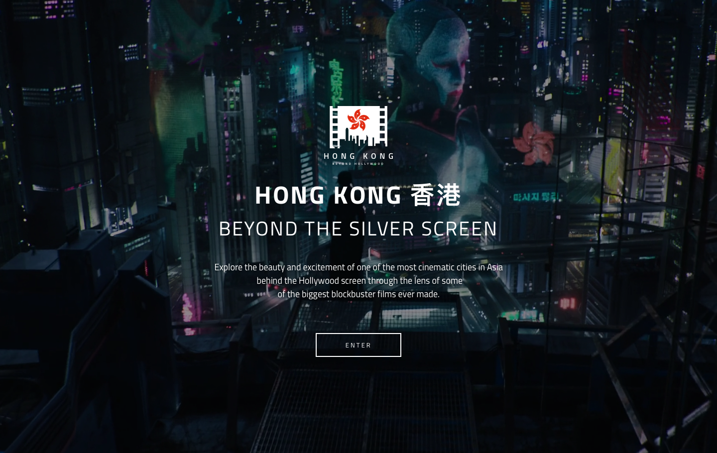
https://vimeo.com/278430807
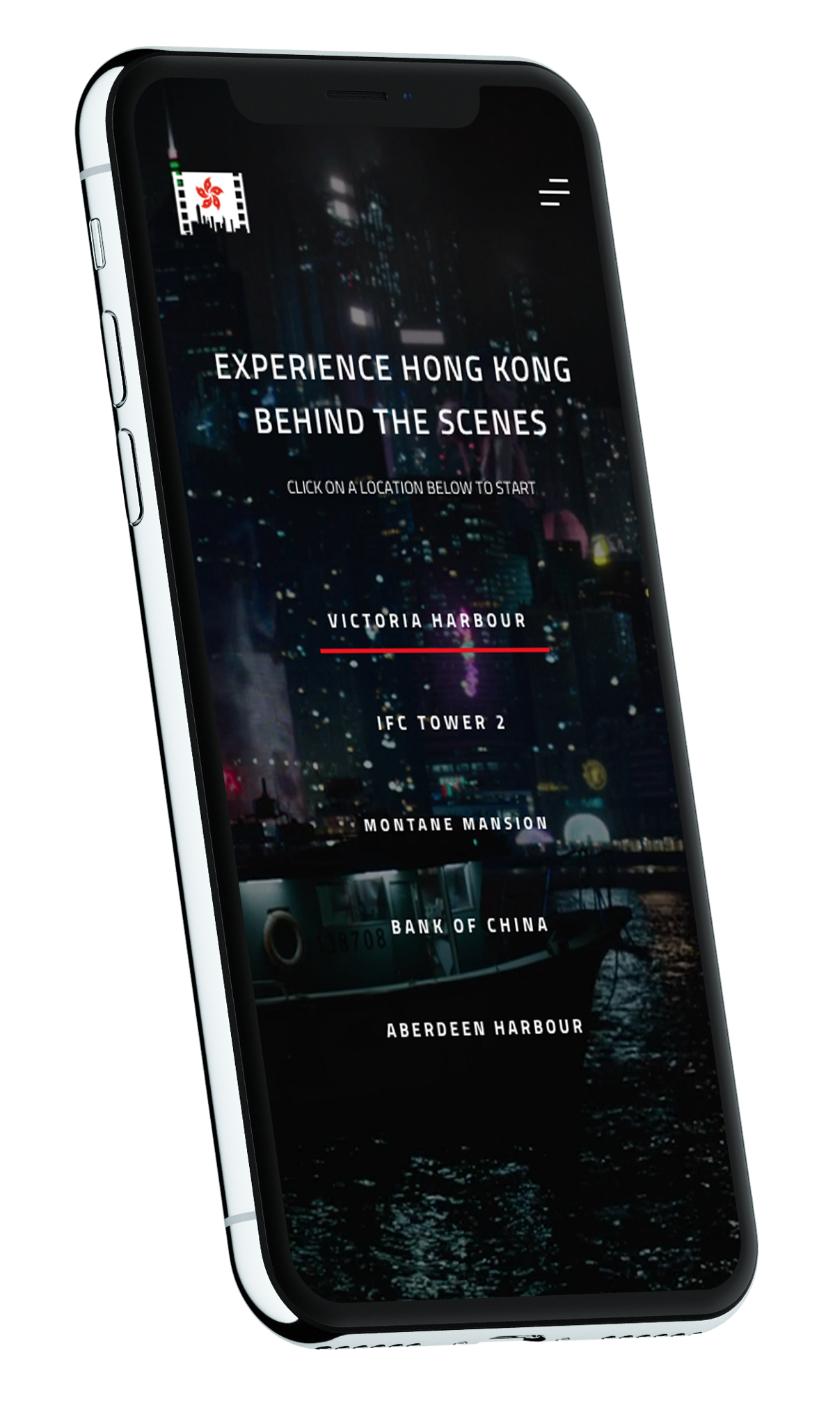
MARKETING COLLATERAL
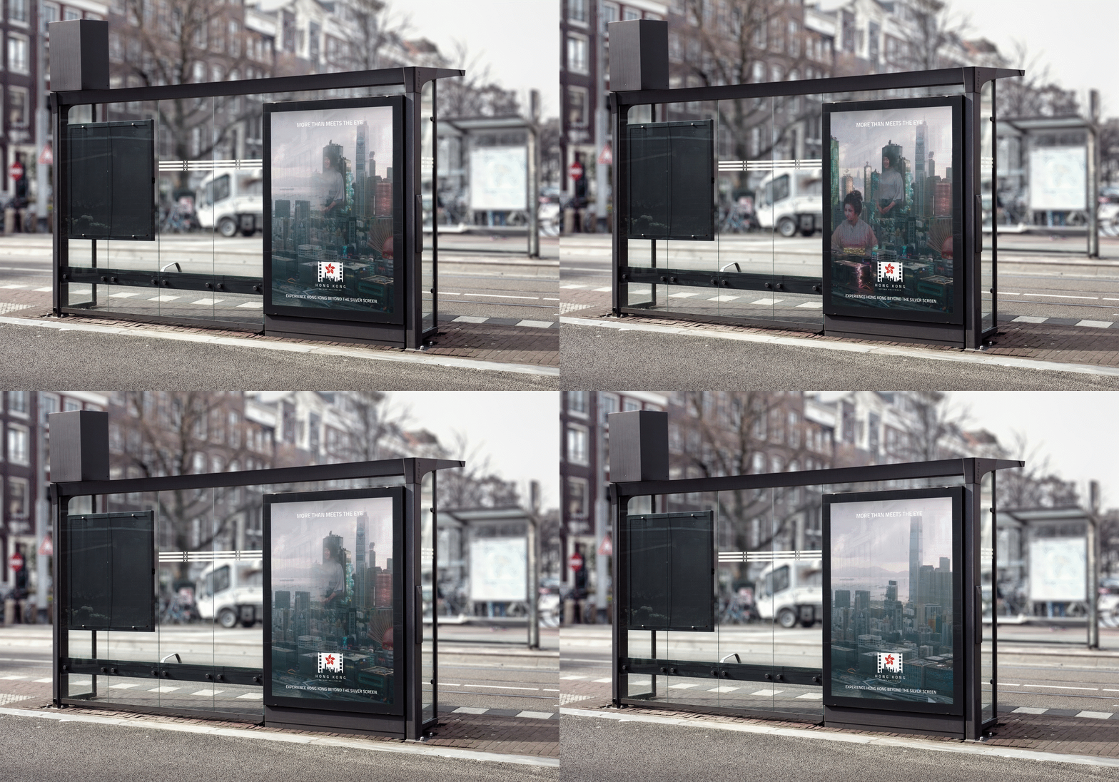
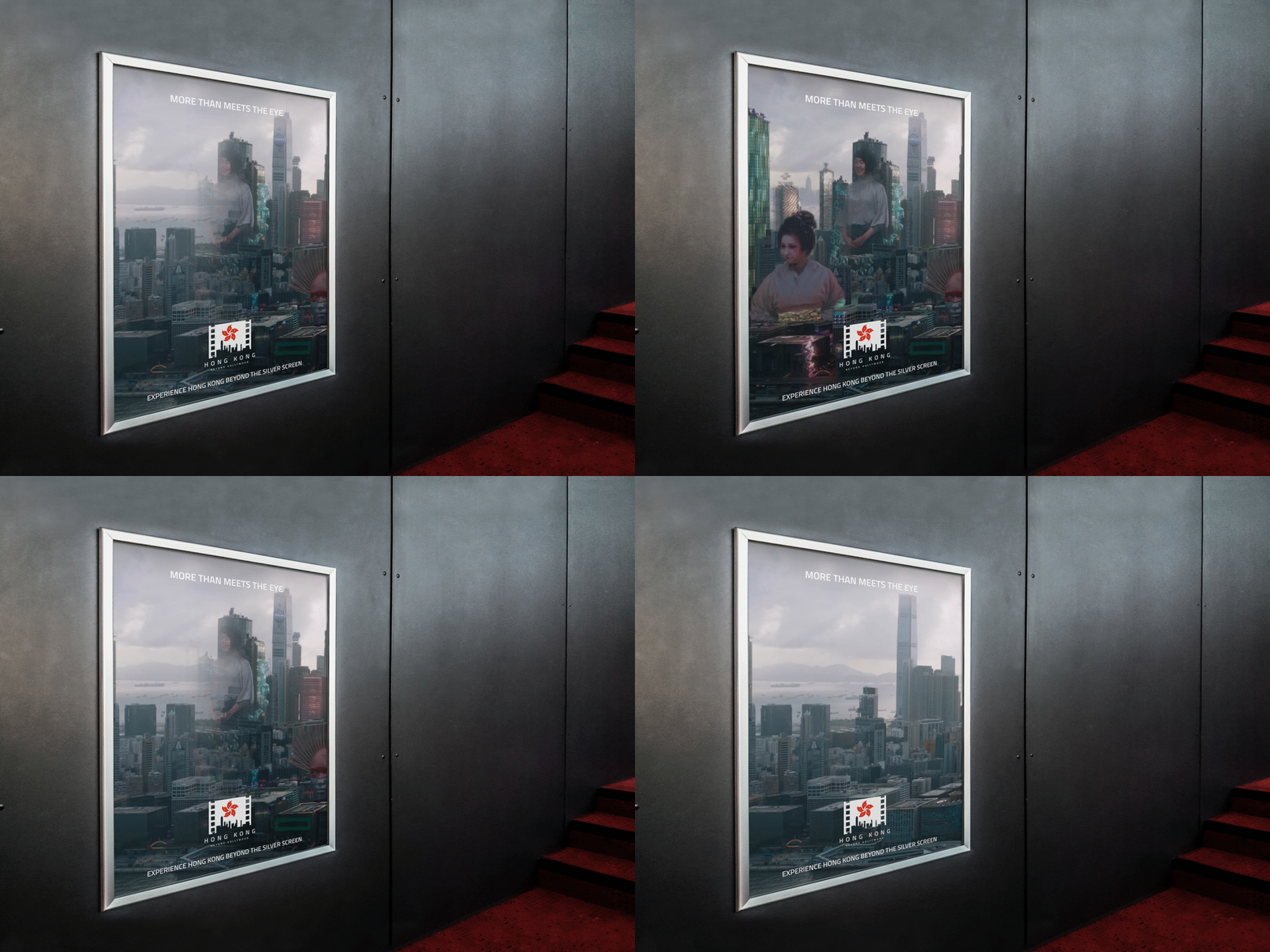
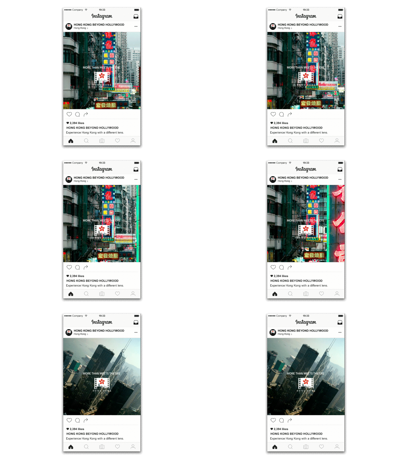
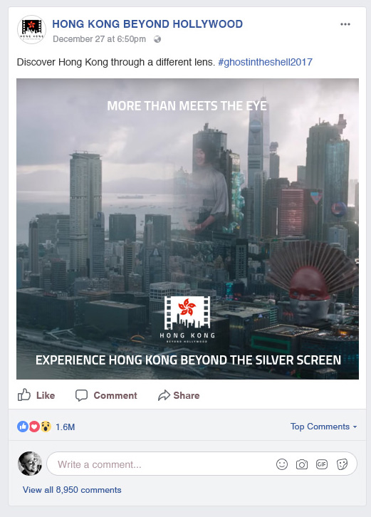
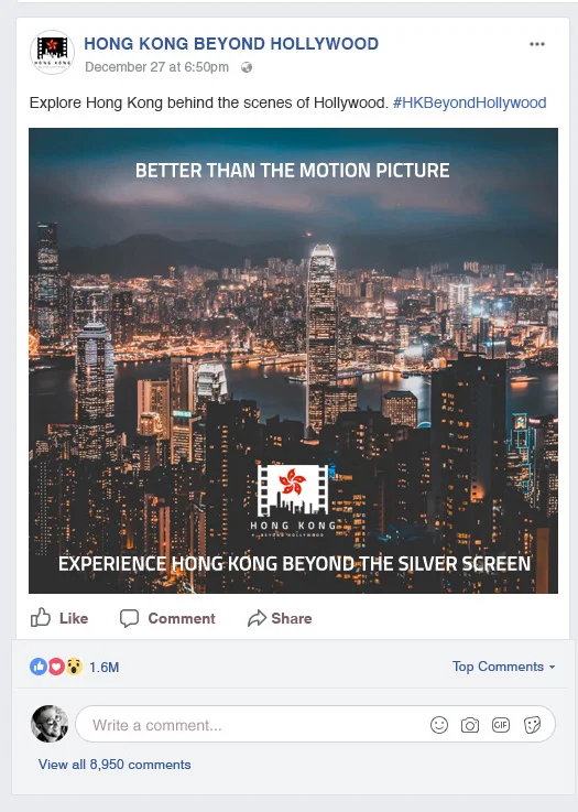
I was going for a moving picture animated theme for my social media/digital ads. They would have video or animated GIFs playing to keep the theme consistent and recognisable. I designed a lenticular bus stop poster and a movie theatre poster so that when pedestrians pass by the poster at a bus stop or in a movie theatre, they will see it change from difficult angles and make them take a second look or do a double take. Merchandise would showcase the logo and adhere to the colours of the style guide.