RADICAL HOSPITALITY
BEYOND SIMPLE ACCOMMODATION
User Interface Design (UI) - Mobile App
OVERVIEW
Radical Hospitality (RH) is more than a company, it is a movement. It assumes best intentions. It does not pay forward. It is not transactional. It is hospitality offered with no expectation of repayment, and every expectation of creating a more deeply connected world full of friends of friends. Friends of friends are people around the world united by the desire to facilitate safe, connected and authentic travel experiences, whether as host or guest.
TIMELINE
3 weeks
PLATFORMS
iOS Mobile Device
ROLE
UI Designer & Scrum Leader
TEAM
UI: Jenifer Wong, Hannah Kerwynn
UX: Angel Wen, Celine Chen, Sierra Pilcher
TOOLS
Sketch, Illustrator, Photoshop, InVision
DESIGN METHODS
Design Inception, Visual Language (Mood, Colour, Shapes, Movement), Moodboard, Art Direction, Style Tiles, Style/Brand Guide, Iconography, Typography, Illustration, Logo Design, Gut Tests
THE CHALLENGE
Travel is expensive, and it can be difficult to really connect into a community if you are staying in generic hotels. Many adventurous travellers choose this option however, because of safety concerns. The challenge is to create a mobile app for RH which will help provide introductions to a global community connected by shared principles and allows folks to ask for and offer everything from use of a bike, help with way finding, sharing meals, or accommodations. As part of the UI team, my partner and I were tasked with creating the UI library and establishing the brand identity along with a stye guide.
PROJECT GOALS
Create a basic platform allowing people to register and sign up to be part of Radical Hospitality, and a simple design that allows people to connect. The app will be similar to couch surfing but safe, connected, and well beyond simply offering accommodation.
“To find what you need, when you need it from others in the community. To give what you can, how you can, when you can to others in your community. And overall, to make kind, meaningful connections.”

RESEARCH & DESIGN INCEPTION
USER PERSONAS
From the UX research data collected from interviews and surveys, we came up with two user personas each with their own different needs and frustrations. Alex is an avid traveller and loves experiencing new cultures and building genuine connections with people. She is concerned about personality mismatch between the host and herself as well as physical safety. Jamie, the host, is a former traveller. He wants to focus on giving back and find travellers that are trustworthy and learn about the their culture. He's worried about guests who freeload and don’t try to make any sort of meaningful connections.
FINAL MOODBOARD
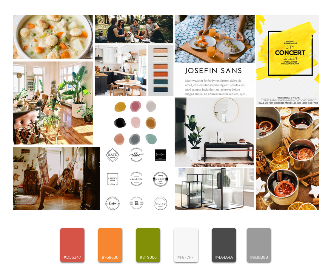
Based on the aforementioned “WHY” or core mission from our client, my UI partner and I explored and came up with 3 initial art directions which we think would best fit the RH brand and to give the client a few options pick from. The client wanted a combination of all our art directions. As a result, in this final moodboard, RH's brand identity is showcased as homely, inviting, welcoming, warm but also adventurous, explorative, open to new experiences, outgoing, social and connected.
LOGO DESIGN
We explored different styles of logo designs through sketches first. We picked the ones we liked best and further iterated and create digital versions of them using Photoshop and Illustrator. We played with rounded ellipse shapes and hard edge shapes like triangles, squares, polygons, as well as playing with the letters R and H itself.
Logo Design Sketches
Digital Renderings and Iterations
Final Logo with Style Variations
UI DESIGN DECISIONS
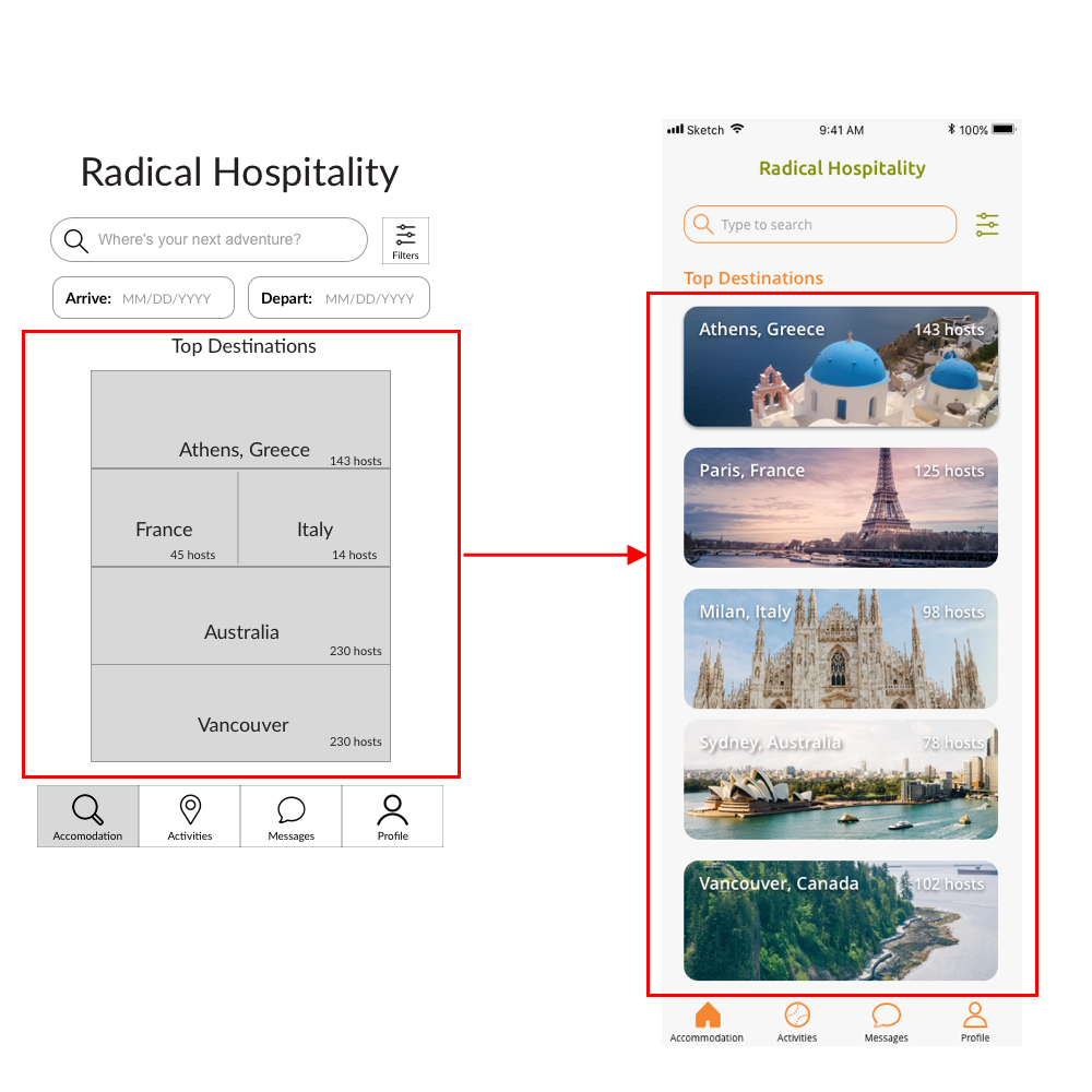
Consistent & clear
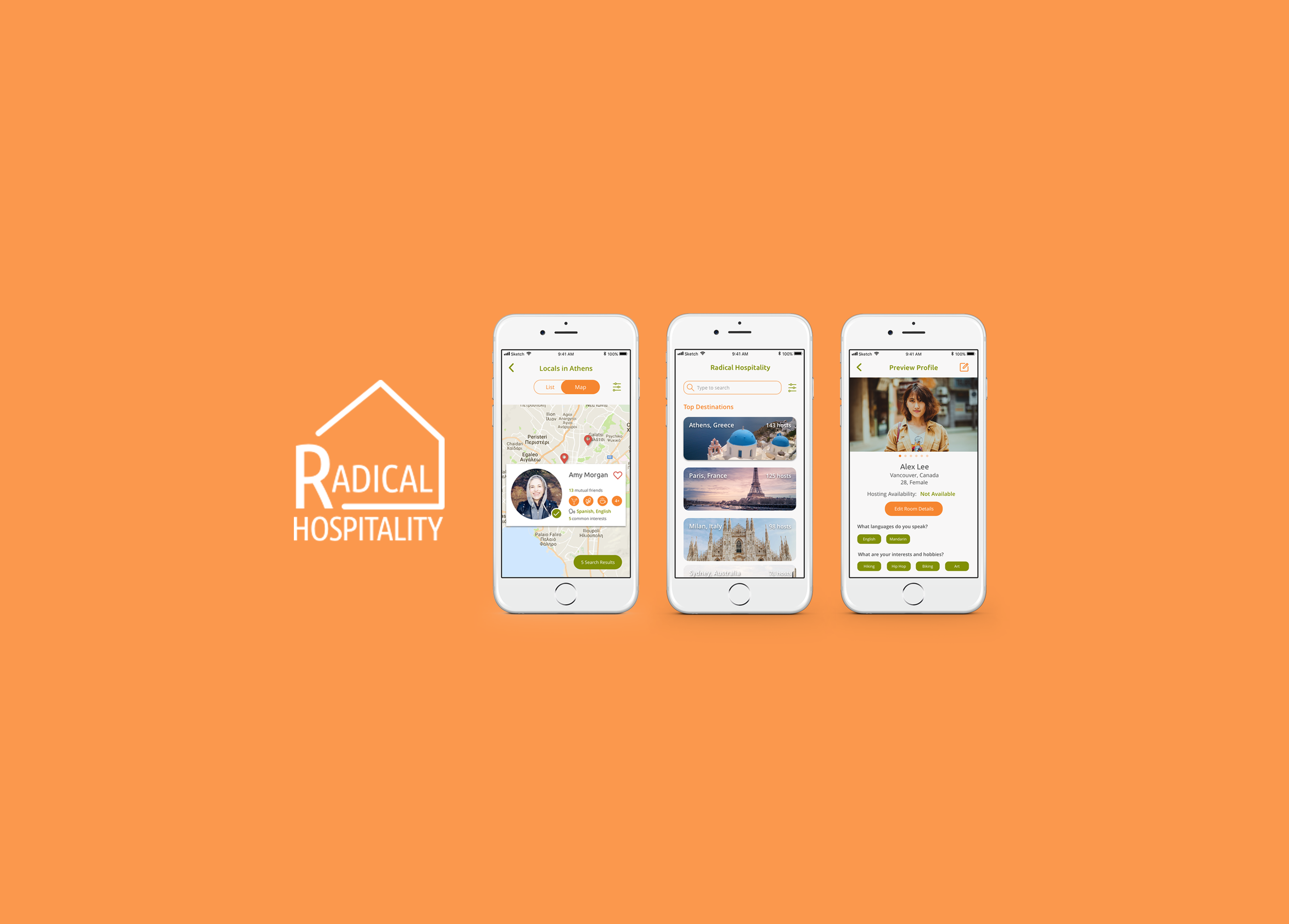
Having alternating banner widths for different destinations could lead to misunderstanding when one location is highlighted or is given more real estate than the other. Therefore, having consistent equal width banners removes this bias.
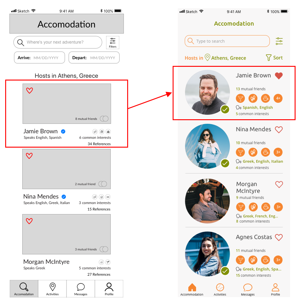
Simplified user card
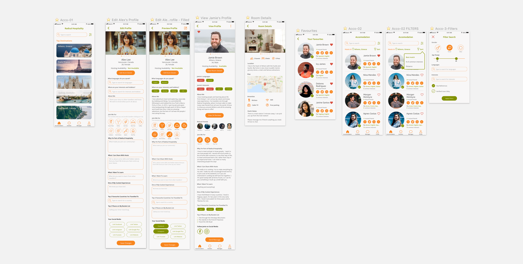
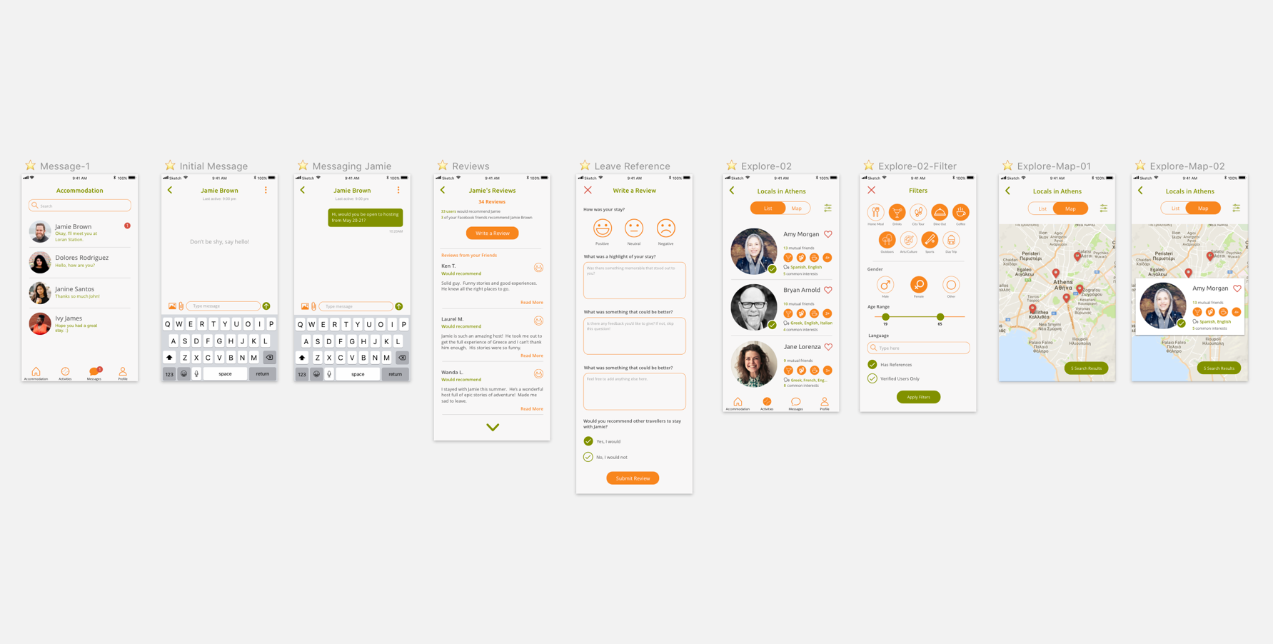
Designing user profile cards was one of the biggest challenges for us. User testing showed that users want specific information at first glance without having to click through. We tried to maximise real estate of each card and reduce clutter as much as possible by taking out information that is not necessary for decision making. We try to use universally recognisable icons to replace text wherever we can.
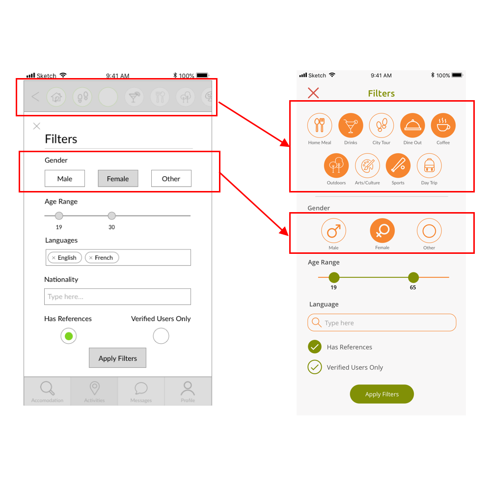
Cleaner intuitive filters
We wanted the user interface to be more visual, friendly and interactive and not so text heavy so we put gender icons for better usability. The activities bar at the top looks confusing to users and is not prominent enough as a filter so we brought it down and enlarged the icons which also kept the brand style consistent.
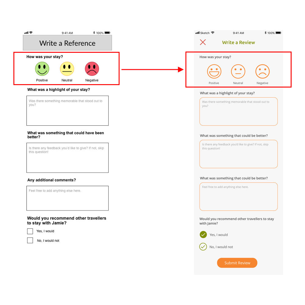
Unbiased feedback
We neutralised the rating system by removing the colours from the smiley face rating system as the colours could bias users. For example, red is a strong colour for a negative rating and we want users to focus on giving constructive feedback.
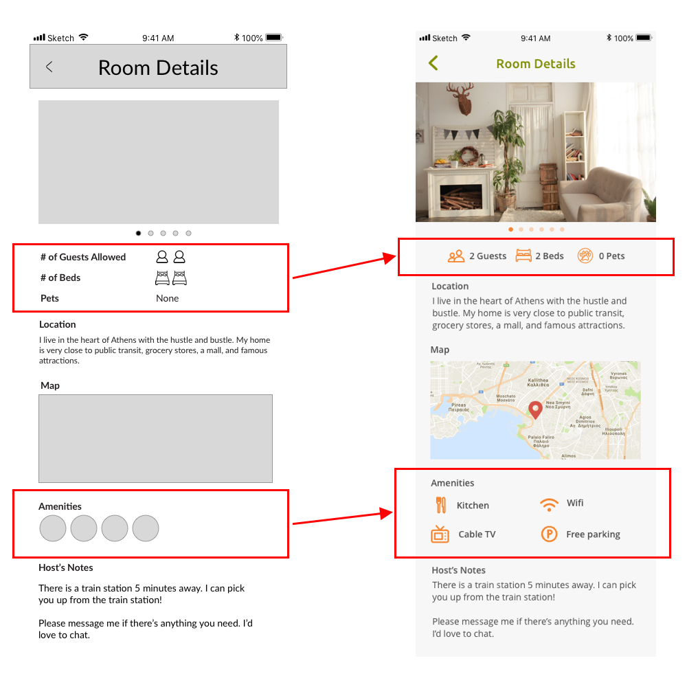
Clarified labels and icons
We try to make full use of space and reduce any clutter as possible for a cleaner simpler design such as using numbers instead of displaying multiple copies of the same icon. Also, for clarity, we accompanied icons with a text label to increase usability.
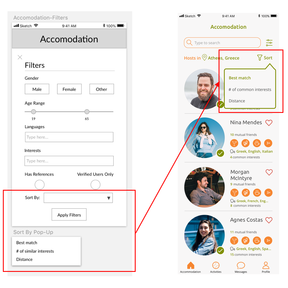
Decluttering filters
Having a drop down pop-up filter within another pop-up filter is problematic and very cluttered so we separated the two filters on the main page itself. "Sort by" and "other filters" have different icons but it is still very intuitive to use.
THE SOLUTION
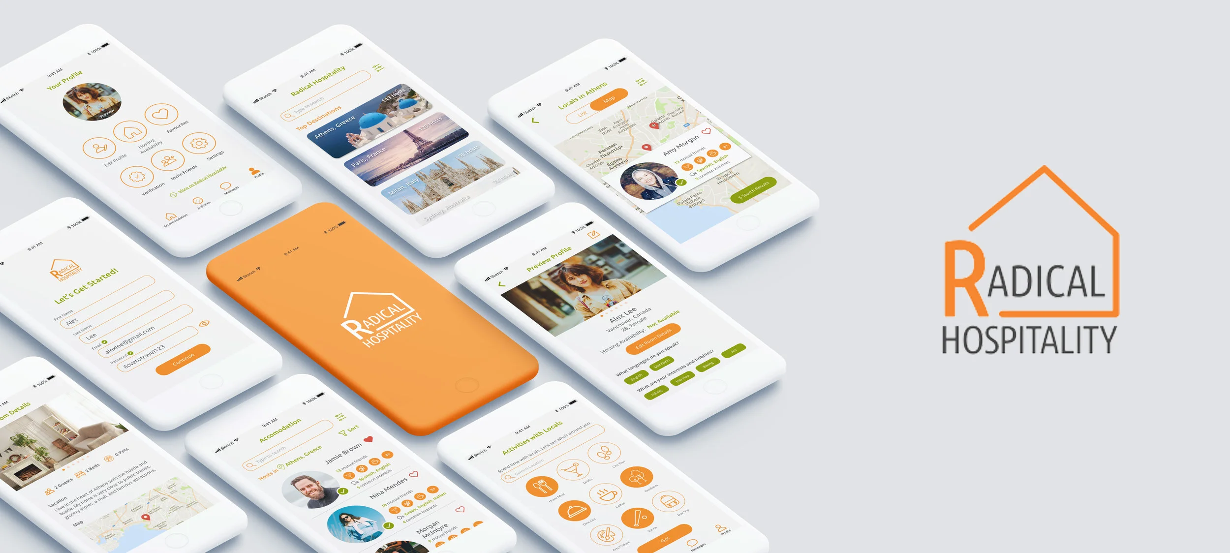
As a result, the solution our team came up with is a comprehensive MVP mobile app that has the most important features based on our research and from gaining user insights.
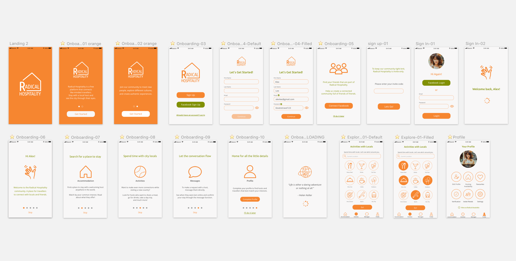
The app has a seamless intuitive onboarding and log in/sign up process to ensure users feel engaged to participate in this community-based venture.
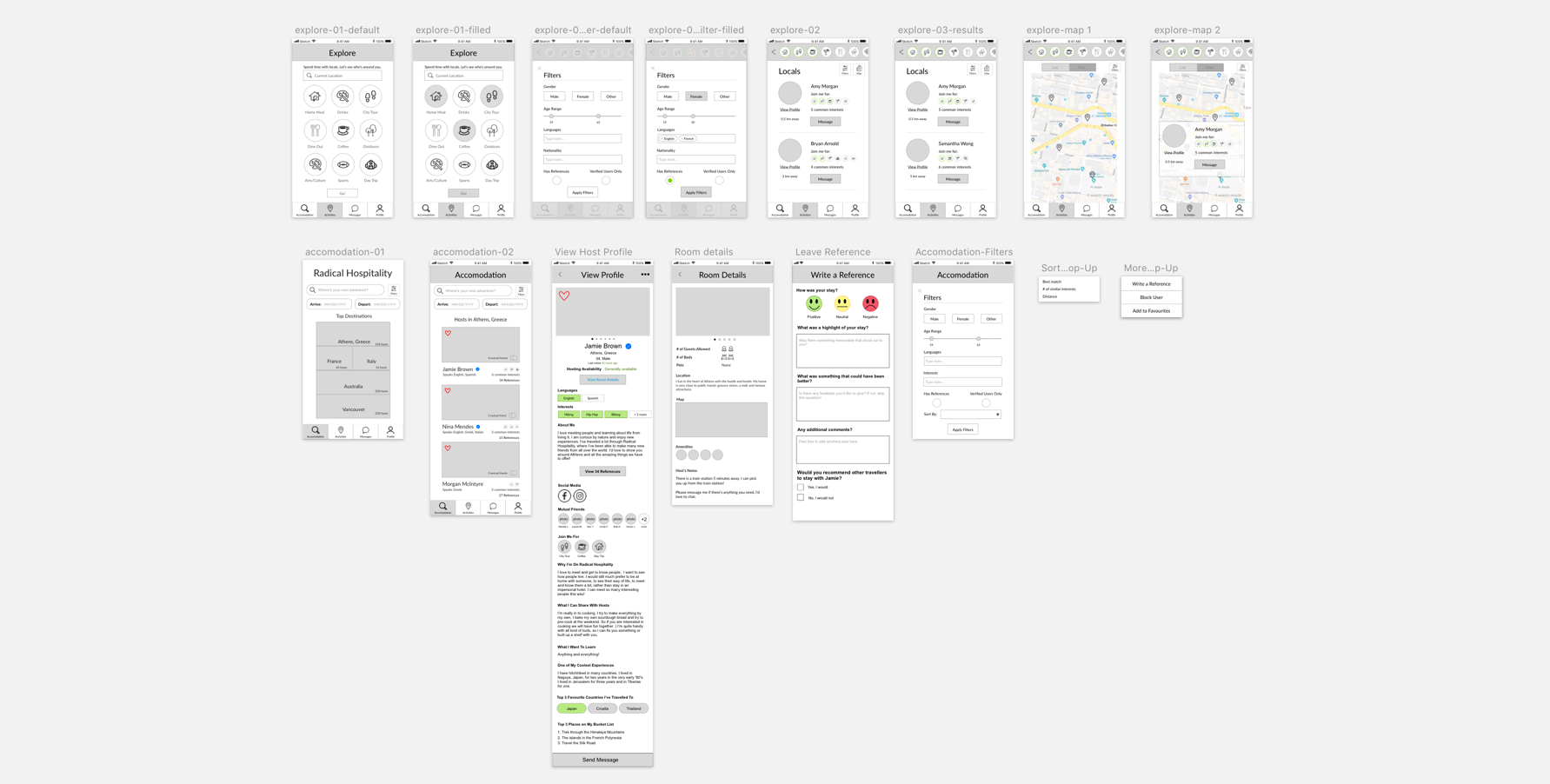
Searching users through list or map view and a highly customisable search filters gives users flexibility to use the app in a way they feel most comfortable with.
A messaging system allows users to communicate and connect with other hosts/guests anytime.
The profile creation section is detailed enough to allow users to get to know each other and make decisions on hosting/choosing accommodation.
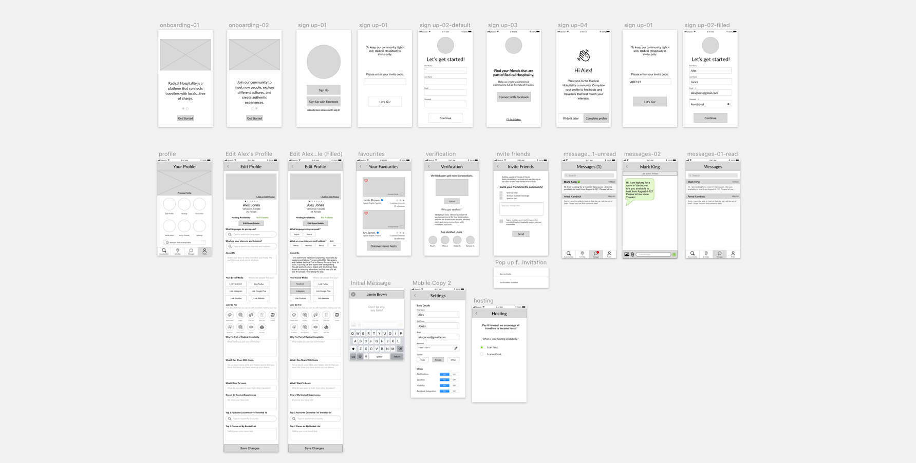
MEDIUM & HIGH FIDELITY WIREFRAMES