
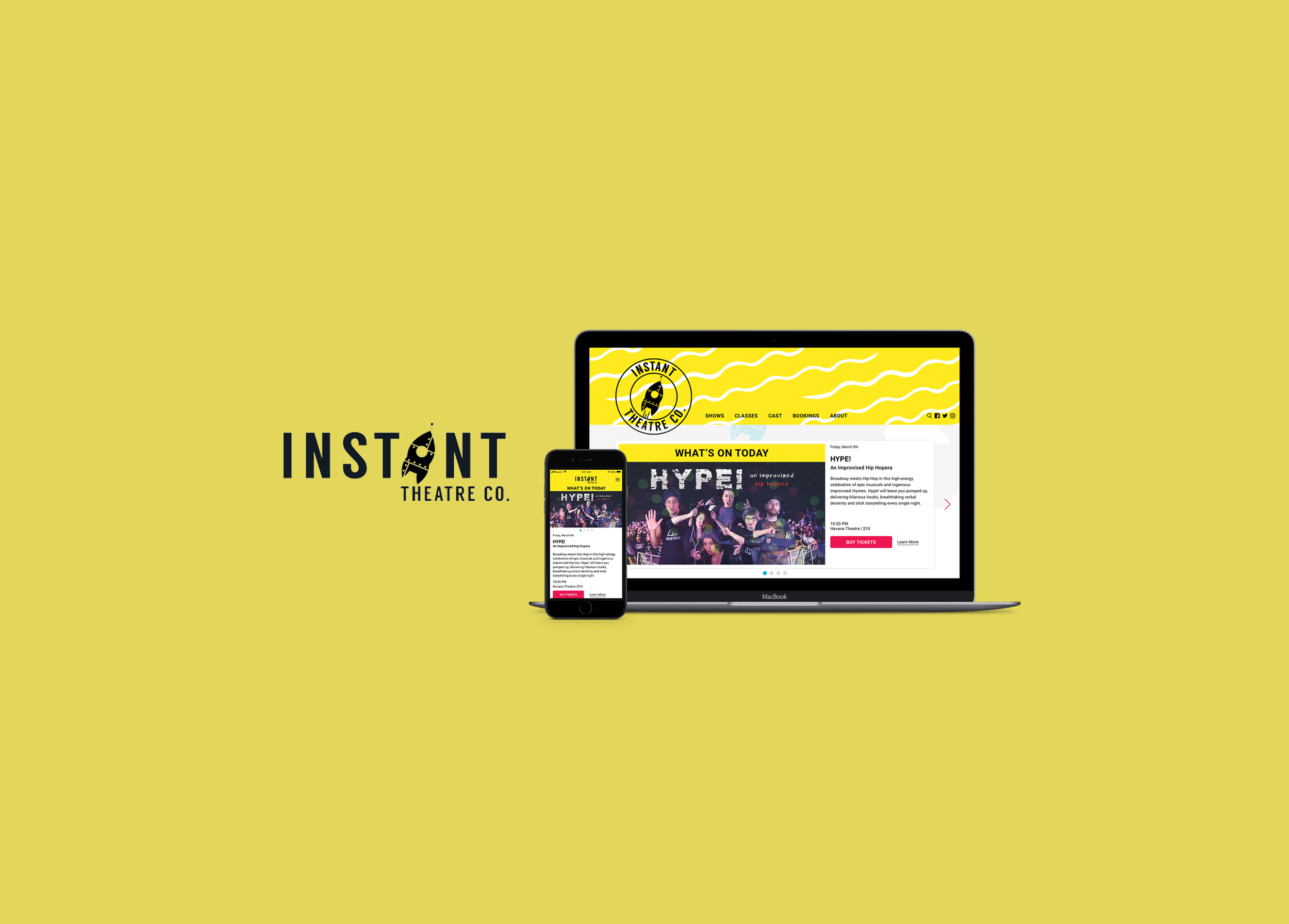
INSTANT THEATRE COMPANY
User Experience (UX) - Responsive Web Design
OVERVIEW
Instant Theatre Company is an expanding non-profit specialising in collaborative theatre. They provide both shows and training in improv comedy, sketch, standup, clown, acting and more. Founded in 1994, Instant Theatre has spent the last 20 some odd years maintaining our reputation as the small yet feisty east van comedy kids. They hope to take their company to the next level to create a community centre focused on creative and collaborative performance in Vancouver. Their motto is, “What do you want to make, and how can we help you make it”.
TIMELINE
3 weeks
PLATFORMS
iOS Mobile Device & Desktop
ROLE
UX Designer
TEAM
UX: Jenifer Wong, Satyen Ram
UI: Shirley Zhou, Gurvi Chandi
TOOLS
Sketch, InVision
DESIGN METHODS
User Research, Domain Research, Surveys and Interviews, Competitor Analysis, Affinity Diagram, User Persona, Storyboarding, User Flow, Sitemap, Information Architecture, Content Audit, Feature Prioritization, Wireframing, Usability Testing, Prototyping (paper and digital medium fidelity)

Affinity Diagramming after user research data collection.
THE CHALLENGE
The Instant Theatre Company's current website is clunky and difficult to edit. They need an interface that is streamlined and clarified for their users — both front and back end. They also need to increase traffic and brand awareness, a better mobile experience, better overall usability, and increase in conversions (shows/classes), and an easy way to boost their SEO. Their current site is based on a Wordpress theme that doesn’t afford them the flexibility they need. They are for example, unable to create a simple page showcasing the current production/play.
PROJECT GOALS
Streamlined interface — both front and back end
Increase traffic
Increase brand awareness
Better mobile experience
Increase conversions (shows/classes)
FEATURE REQUIREMENTS
Calendars / tables
Custom feedback / contact forms
Featured plays should link to Eventbrite
THE SOLUTION
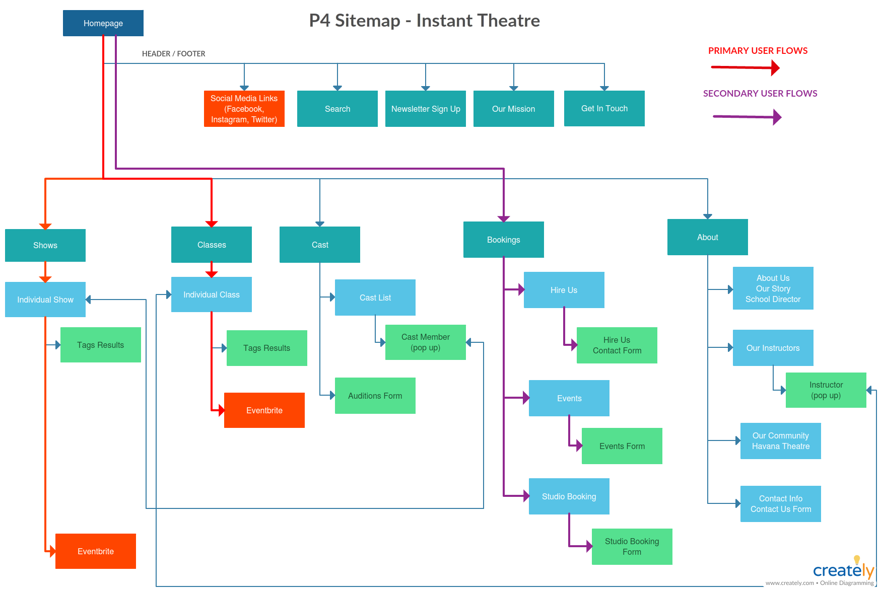
USER FLOW & SITE MAP
We created a detailed sitemap to get an overall picture of what screens/pages we would need for the entire site along with some features to be considered for each page. The information architecture and content hierarchy needed to be redesigned as users found it hard to find what they need. The focus of our primary user flow is to allow the user to buy tickets to shows and filter all the variety of shows according to their preferences, registering for classes. For business users, the flow is to hire the theatre, fill in forms to inquire about the theatre’s services, book events, and rent the studio spaces.
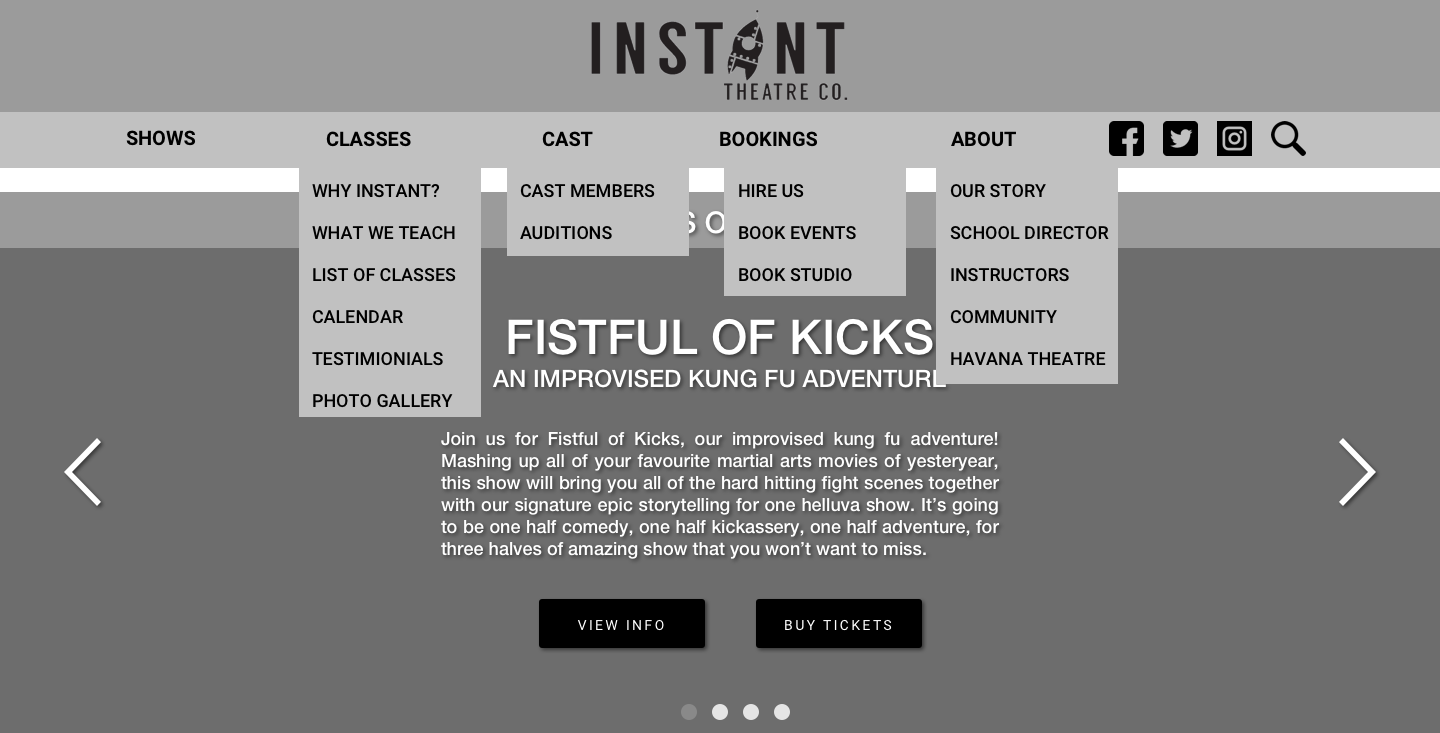
IMPROVED NAVIGATION
We redesigned the information architecture and main navigation bar as well as the secondary navigation bar as it was quite cluttered and disorganized. User testing showed that navigation was challenging. In the original website, the “Buy Tickets” button synonymous with Eventbrite and the “Shows” button on the nav bar, therefore, causing confusion for users as there is no difference and they were redundant. Any main page containing different sections in it would have a clear drop-down secondary nav bar underneath it for easier navigation.
HOMEPAGE REDESIgn
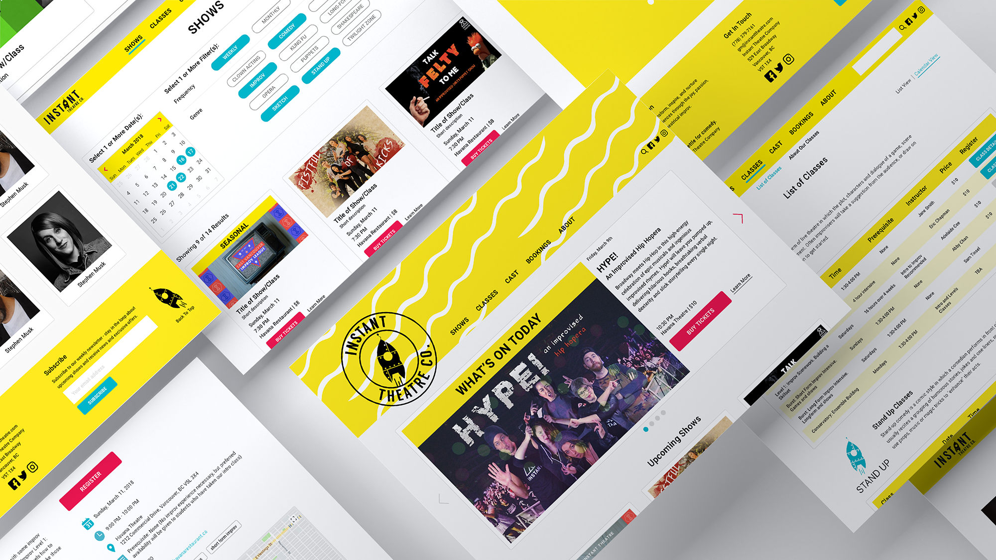
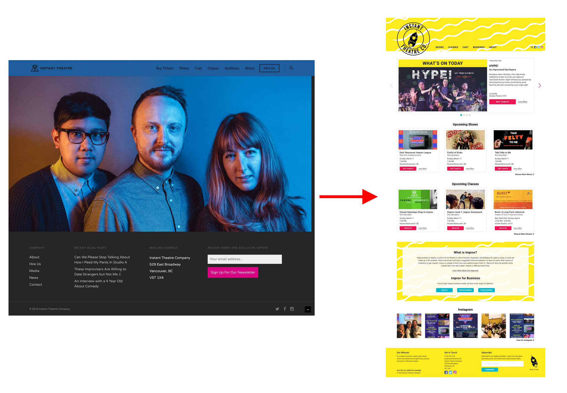
The space on the home page is not well used. The hero banner/photo on the home page is unpopular with many users. The "Blog" section has been removed completely from the footer and the site as a whole. We maximised real estate for the home page. The banner is now a carousel that rotates left automatically. The banner displays shows on today because the user would like to be able to buy tickets on the go last minute. We added Instagram photos because social media is a huge asset to reach out to more audiences. We also added a “What is improv?” for new users.
CONSISTENT CLASS TABLES
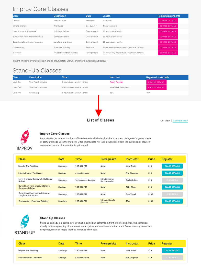
Tables are inconsistent on the current site and users found information was missing like price which was information they wanted to be able to see from first glance without having to click into course details to find it. We made table information consistent across all classes and we added new columns including prerequisites, instructor, price and merged class and class description to save space and to add new columns of information requested from user testing.
ALL-In-One CALENDAR/SCHEDULE
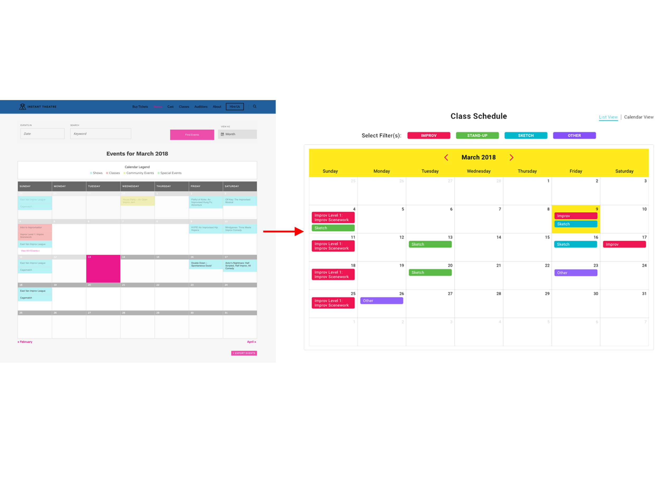
From user testing and interviews, most users appreciated this colour coded calendar so we included this as it is a more visual way to represent the same information as the table format of the class list. The filters are colour coded based on the 4 different classes offered at Instant and this enables users to see what classes are being held at what time and day at a quick glance.
FORM REDESIGN
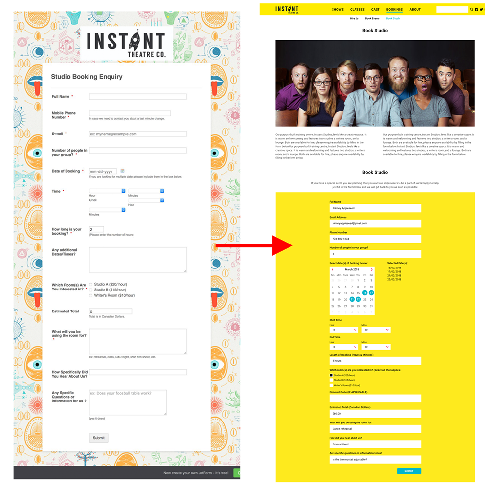
Current forms for booking studios and inquiries are on third party websites like Google Forms and Jotform. This leads to consistency issues and backend issues when it comes to organising submissions from different sources. We redesigned these forms and the Hire Us page to be incorporated within the site to keep users on the website without leaving.