HUBBL TECHNOLOGIES
POWERFUL ORG INTELLIGENCE FOR SALESFORCE
Product Design - Web App
OVERVIEW
The deepest analysis of your Salesforce org, Hubbl Diagnostics provides actionable insights to reduce costs and drive revenue. Hubbl gives you a universal look into the current state and complexity of your Salesforce org with one simple scan. Our mission is uplifting and empowering the entire Salesforce ecosystem through powerful org intelligence. Hubbl acts like both an MRI and DNA test, scanning for underlying issues such as security vulnerabilities, performance risks, user adoption challenges, and process inefficiencies, creating a strong foundation to operate businesses at their highest potential. Then Hubbl uses AI to automatically implement improvements, or guide teams through the process, with intelligent recommendations, tapping into the collective wisdom of other businesses.
PLATFORMS
Desktop Web App
ROLE
Senior UX Designer
TEAM
Product Manager, VP of Engineering, Technical Lead, Senior Developer, Data Scientist, Co-founder & COO
TOOLS
Figma
DESIGN METHODS
Charting and Data Visualization, Competitor & Comparative Analysis, User Flow, Information Architecture, Content Audit, Feature Prioritization, Wireframing, Prototyping, MVP design (Minimum Viable Product), Wireframing (low, medium, high fidelity), Responsive Web Design (desktop & mobile)
THE HUBBL SCORE
THE CHALLENGE
The Context (The Scenario)
Over years of use, enterprise Salesforce organizations naturally accumulate massive technical debt, redundant configurations, and bloated metadata. This complexity silently drains operational efficiency, turning what should be simple system updates into risky, time-consuming troubleshooting bottlenecks for Salesforce consultants and administrators.
While system diagnostic tools exist, they typically spit out massive, overwhelming spreadsheets of raw technical data. Consultants are left with a mountain of telemetry but no clear understanding of where to start, how to prioritize, or how to prove to stakeholders that their cleanup efforts are actually working.
The Problem Statement (The "Why")
When org complexity goes unmanaged, organizations face degraded system performance, poor user adoption, lost ROI, delayed timelines, and hundreds of lost hours spent manually auditing metadata.
Salesforce consultants and administrators struggle to optimize tech-debt-heavy orgs because existing diagnostic data is too complex to prioritize, and abstract system health scores do not clearly connect to their immediate daily tasks (like improving security, or reducing tech debt).
Furthermore, users lack a visual feedback loop to prove how their specific remediation efforts impact overall org health over time, making it difficult to demonstrate value to stakeholders.
The Design Challenge (How Might We...)
To guide our design process, we focused on three core How Might We questions:
HMW translate overwhelming system metadata into a digestible, relative scoring system that immediately signals priority?
HMW seamlessly bridge the gap between a high-level health score and a user’s concrete, daily tasks (e.g., security audits or migration workflows)?
HMW design an intuitive historical feedback loop so users can visualize the direct, positive impact of their work on the score?
PROJECT GOALS
The goal is to improve the Health score calculation and visual, so users will have a chance to:
Use the Hubbl score to drive their decisions
See the correlation between solving recommendations and improving the Hubbl score and its contributing factors.
Engage and use Hubbl more often
REQUIREMENTS
create the Hubbl Score and explain how it works
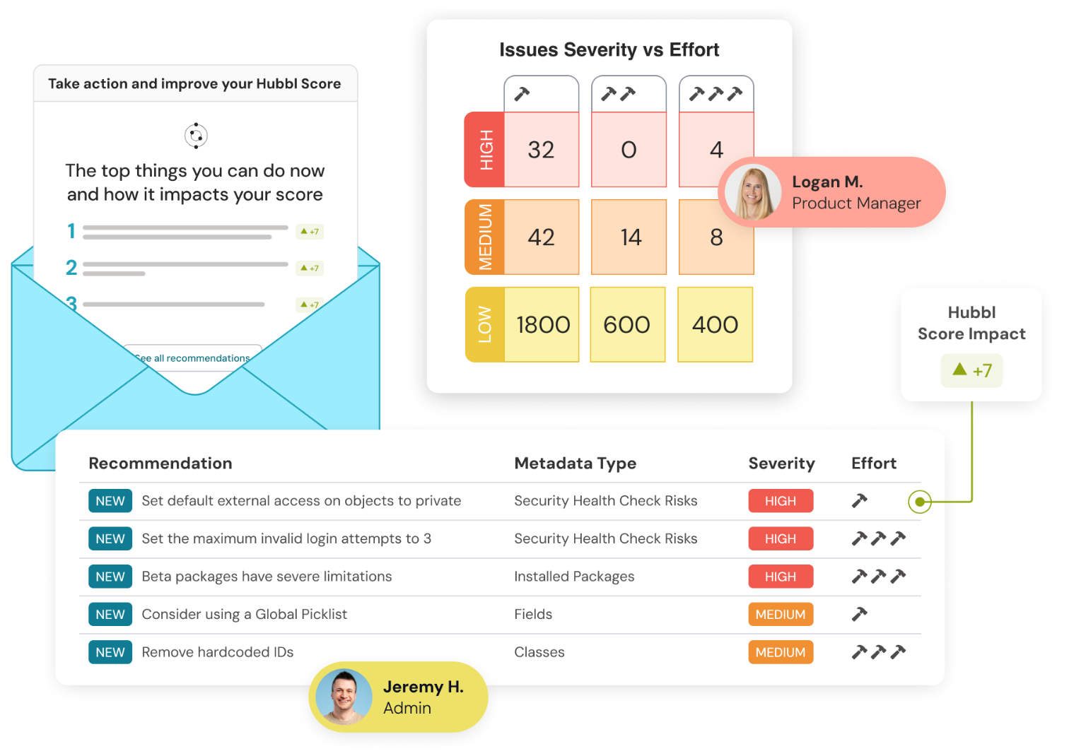
provide action plan and link to recommendations
clear call-to-action on Summary dashboard
RESEARCH & DESIGN INCEPTION
Our user research brought up the following key insights from user interviews and surveys: Most users use Hubbl to scan their org once or twice but they do not further engage with the app afterwards. And most do not know what the next steps they should take after seeing their scan results, the dashboards are dense and data heavy but with no clear conclusion. Our hypothesis is that introducing the Hubbl score somewhat gamifies the concept of org health and its complexity and would encourage users to log into Hubbl more often to see if their work or tasks has impacted the score. The number one most cited feedback was the lack of an action plan moving forward on what to do, lack of clear recommendations on how to tackle issues within the org, and how to raise the Hubbl score overall.
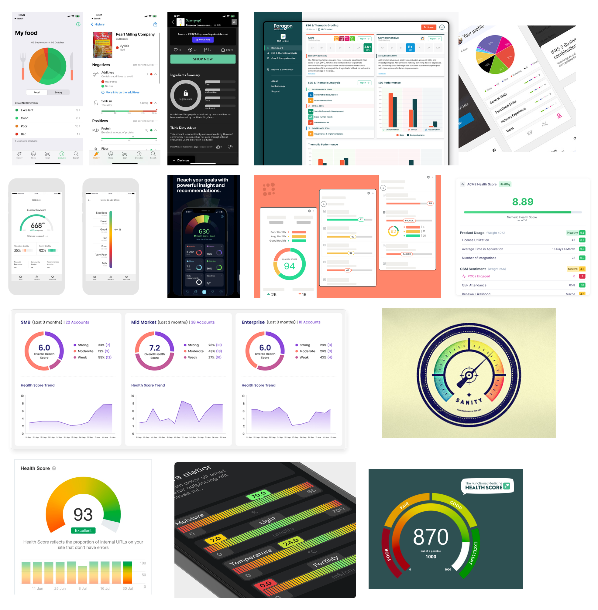
I first compiled different types of charts and data visualizations to get inspiration on how scores are interpreted and presented in other similar contexts. The score is made up of different factors that contribute to the score and since the home dashboard (aka the summary dashboard) is already quite dense with information, data points and charts, it was a challenge to fit an information dense score into one box in the top left hand corner. Simplicity is key here so as not to overwhelm the user with information on a data-heavy dashboard.
I brainstormed ideas from interface inspiration I found online. Then narrowed it down to a few options. The final contenders were a semi-circle dial or gauge like credit score apps, and a power bar resembling a battery.
ITERATION & DESIGN DECISIONS
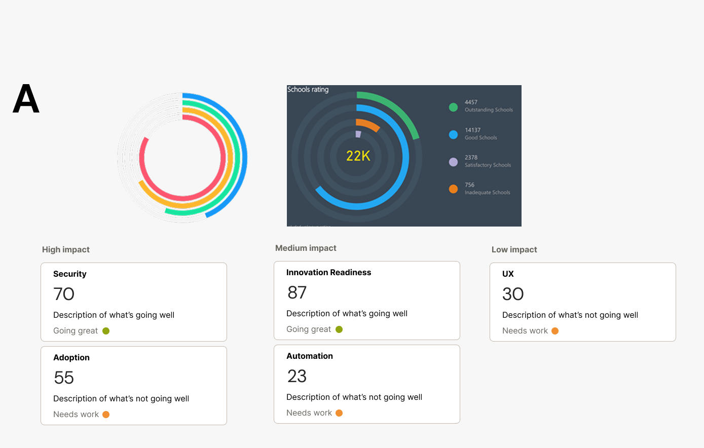
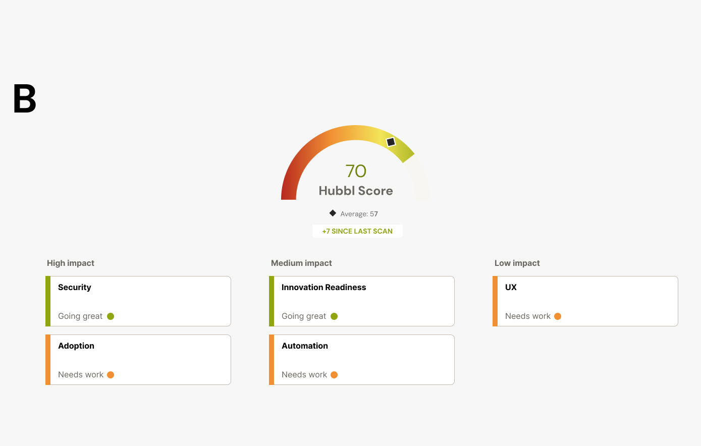
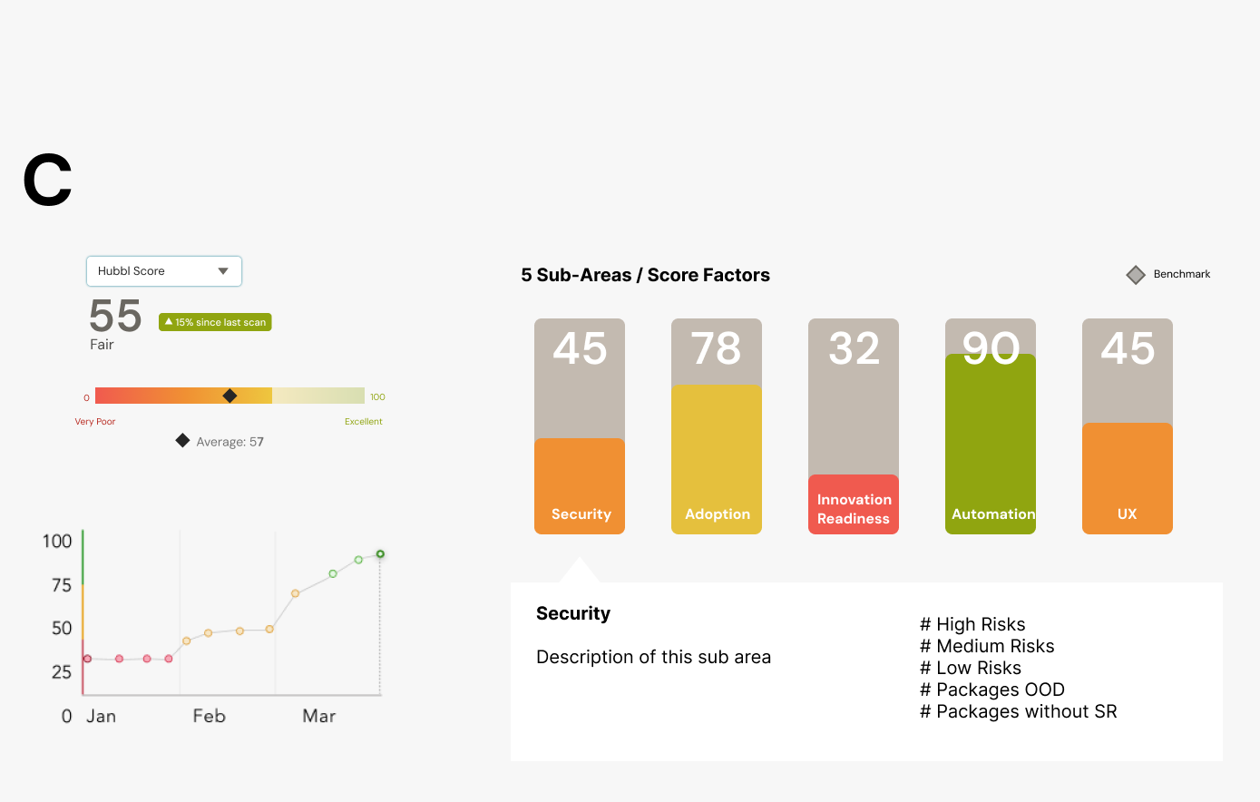
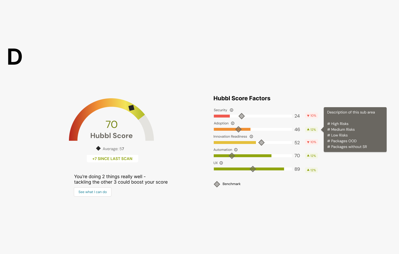
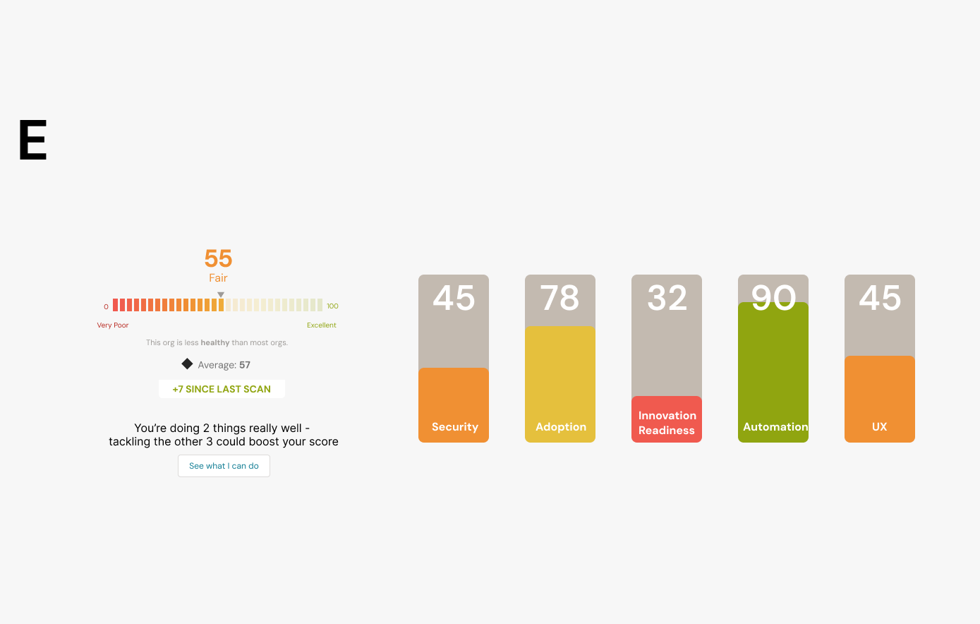
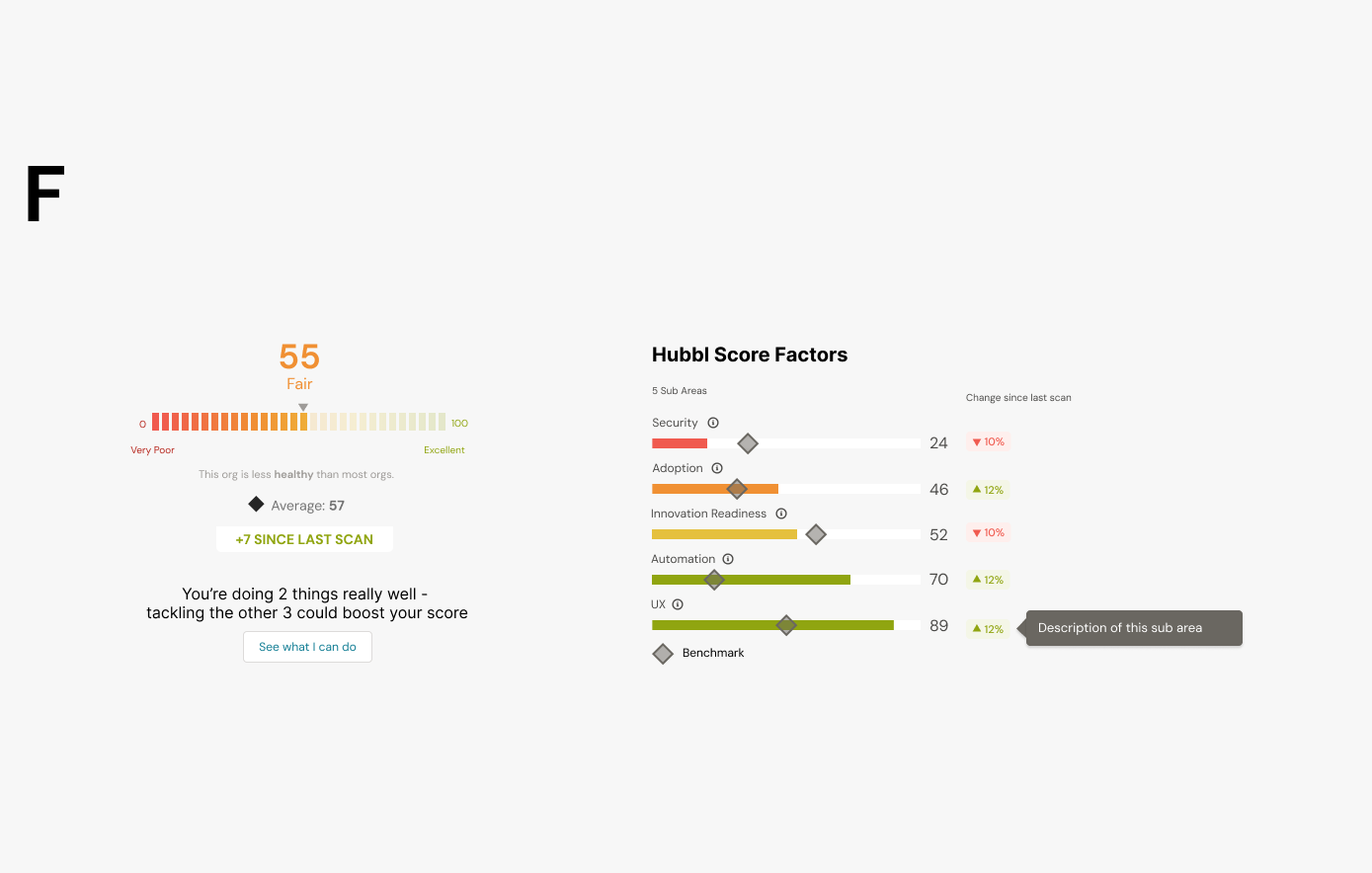
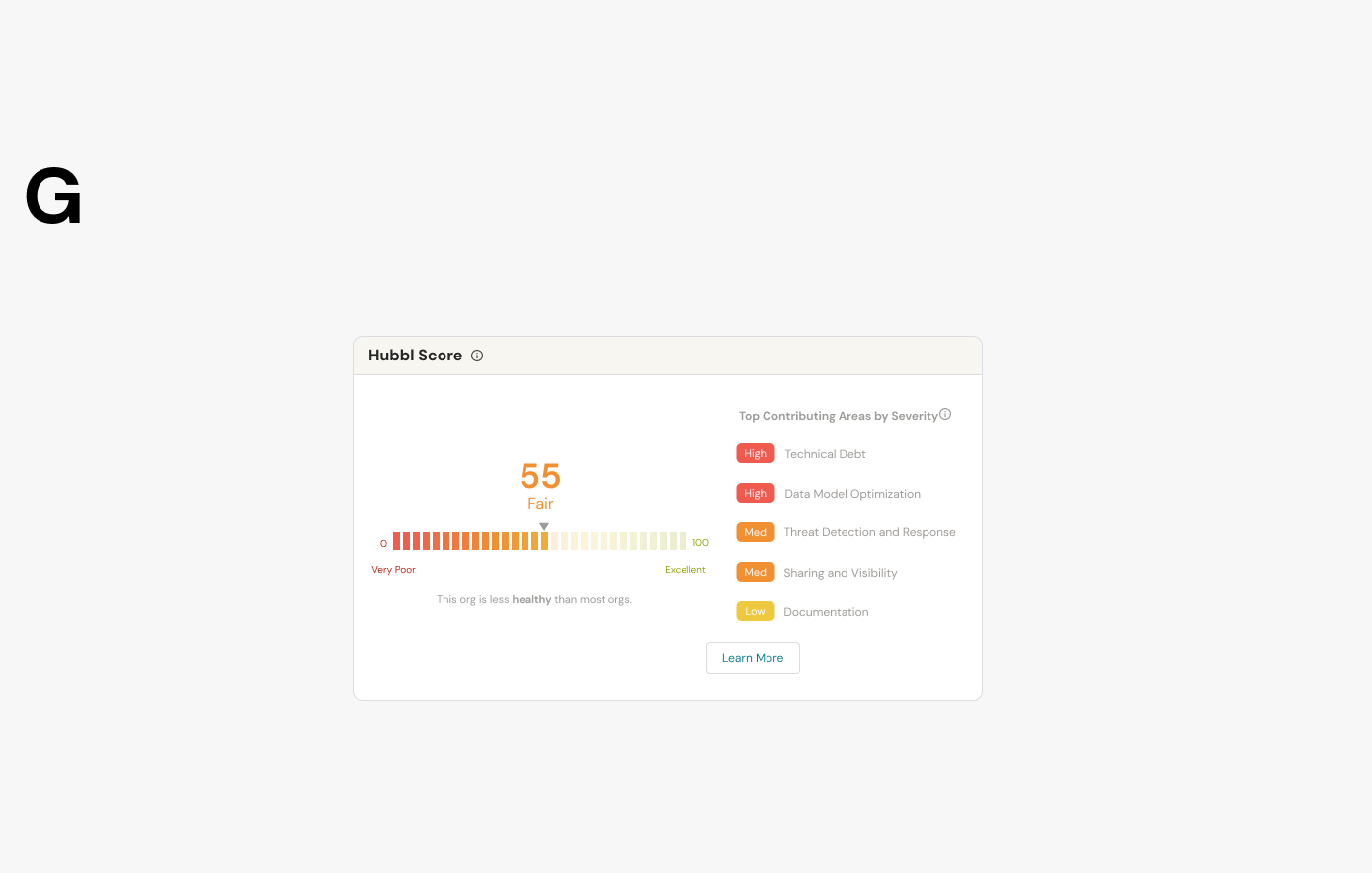
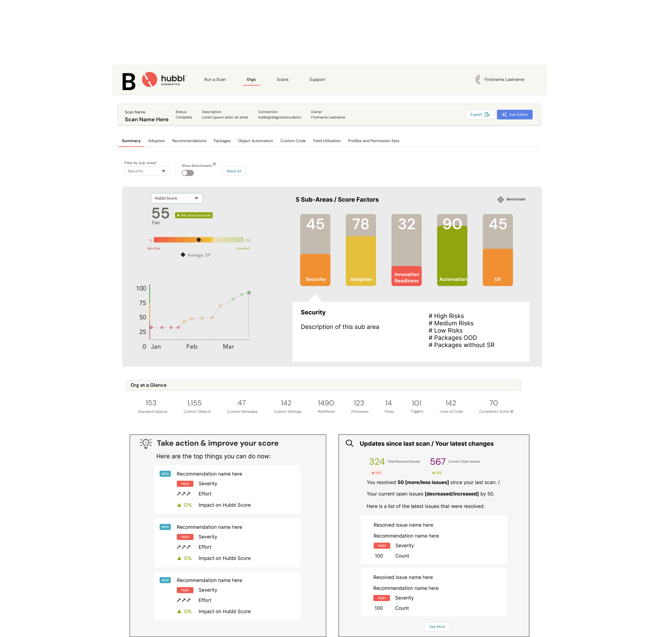
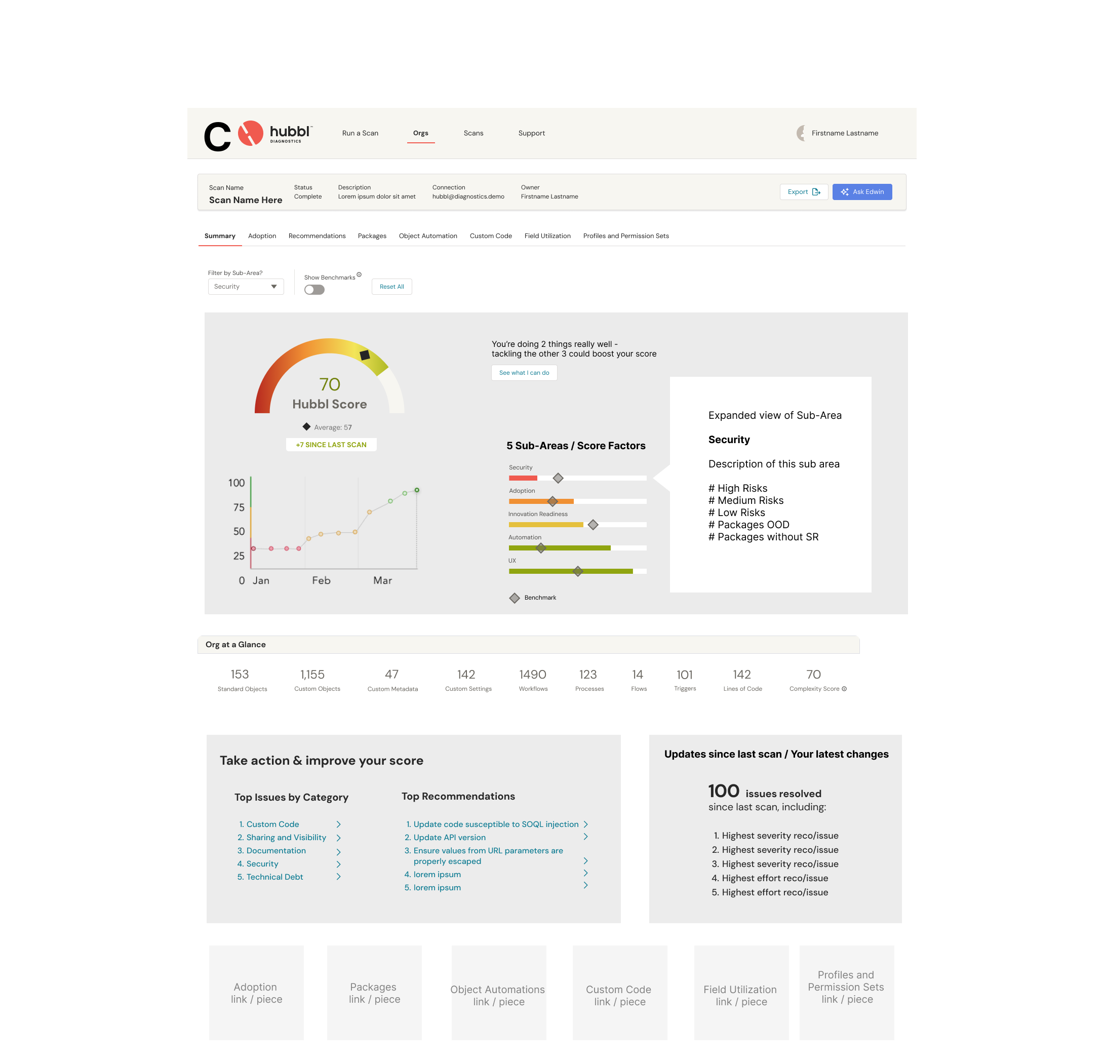
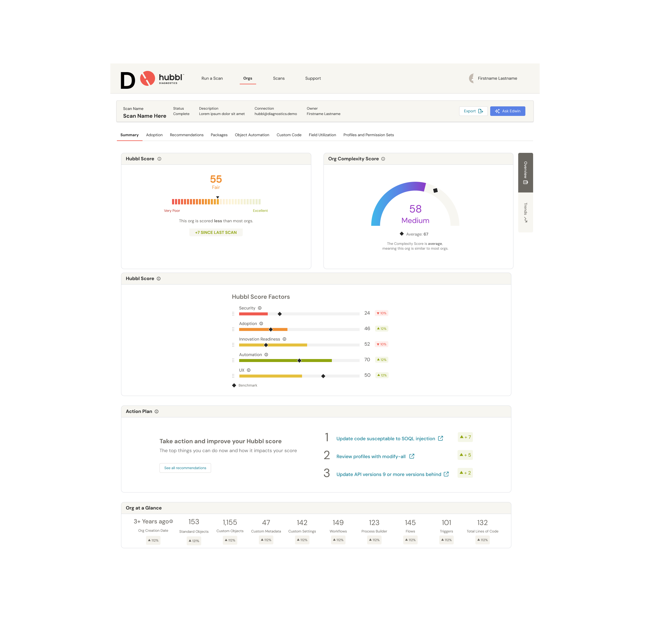
I mocked up some low-fidelity wireframes and rough concepts, I explored multiple layouts before committing to one. The Hubbl score, which indicates the health of the org, will contain 5 sub-areas: Security, Adoption, Innovation readiness, Automation, UX. In the design. we needed to highlight:
current score and benchmark
sub-areas scores or score factors
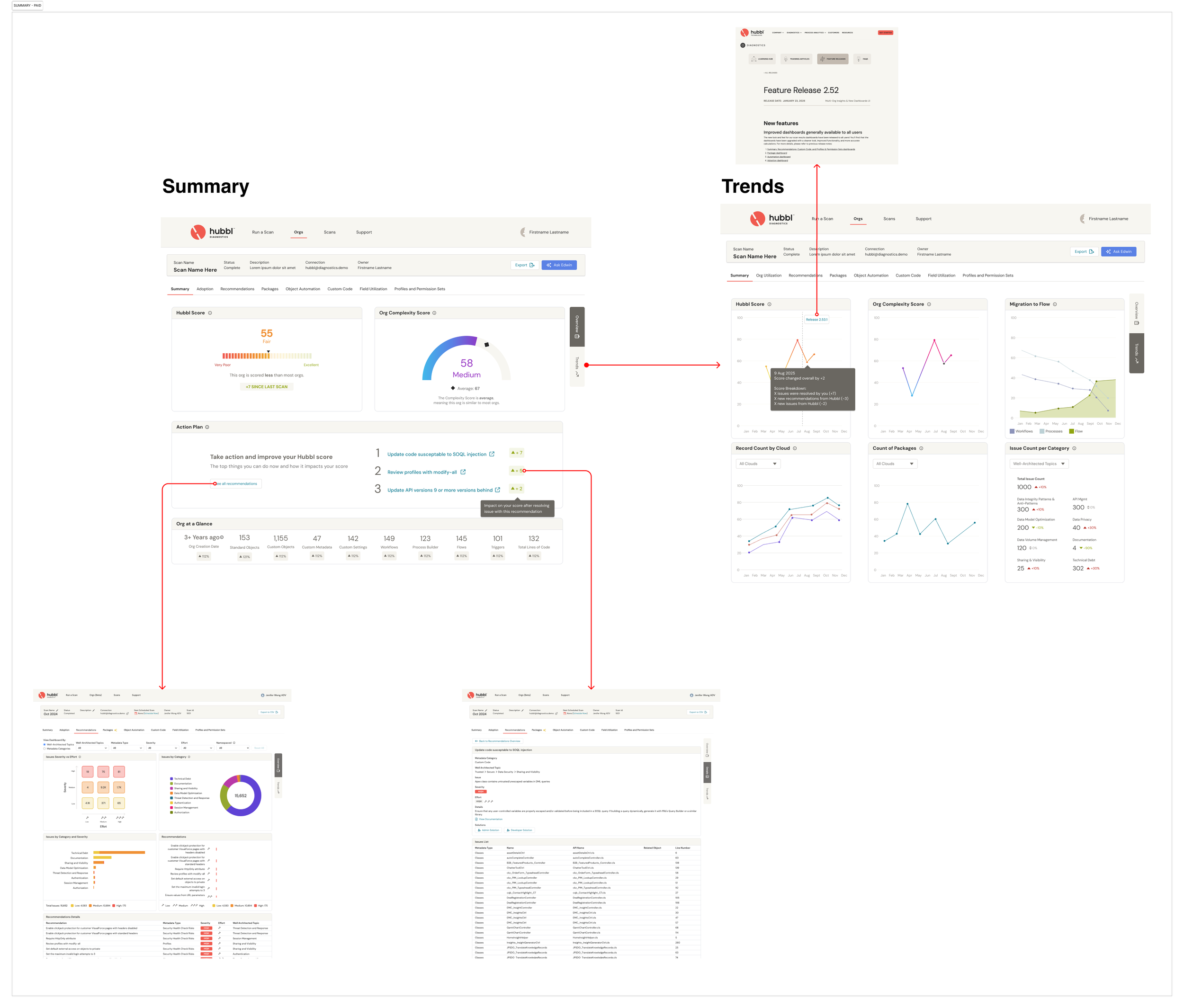
trend of the score (show changes in the score over time and impact from user’s actions)
changes/deltas from previous scan
The score factors is ordered from worst to best and clearly shows the relative scores with both the bars and coloring. I drafted up multiple options of the score and it’s contributing factors, and shared these with my team to get feedback and narrow down to a few.
RECOMMENDATIONS & ACTION PLAN
Steps on what to do next was one of the most common feedback given based on user interviews with existing clients. Users are faced with a maze of uncertainty and overwhelming amounts of data, metadata, and charts. As Salesforces product owner, they feel something is off in the org, but don’t know where to start. Too much noise. Not enough signal. Everyone has opinions. No one has answers. Prioritization becomes guesswork. Technical debt piles up. Timelines slip. a groundbreaking feature that delivers instant clarity on exactly what to fix next in your Salesforce org to unlock speed, adoption, and ROI.
The purpose of the Hubbl Action Plan gives users clarity on what’s happening in the org and a clear next step to improve it. No more guessing, circular conversations or chasing fires instead of fixing foundations. No more rehashing the same conversations. No more fixing the same thing twice. Built with strategy in mind, the Hubbl Score quietly evaluates the org behind the scenes and translates complex system signals into crystal-clear guidance. Native Salesforce tools only tell users what exists. But they rarely tell what matters. The Score isn’t about getting a perfect score, it’s about creating a clear, shared direction that the whole team can align behind.
After running a scan of their org in Hubbl, they get a prioritized, impact-driven plan that tells them:
What’s broken
Why it matters
What to fix first
How it affects adoption, performance, and ROI
The Hubbl Action Plan goes beyond basic audits or “best practices” and delivers context-aware recommendations that help users:
Cut through the noise and focus on what moves the needle
Improve performance and adoption — without second-guessing
Monitor improvements over time and track measurable progress
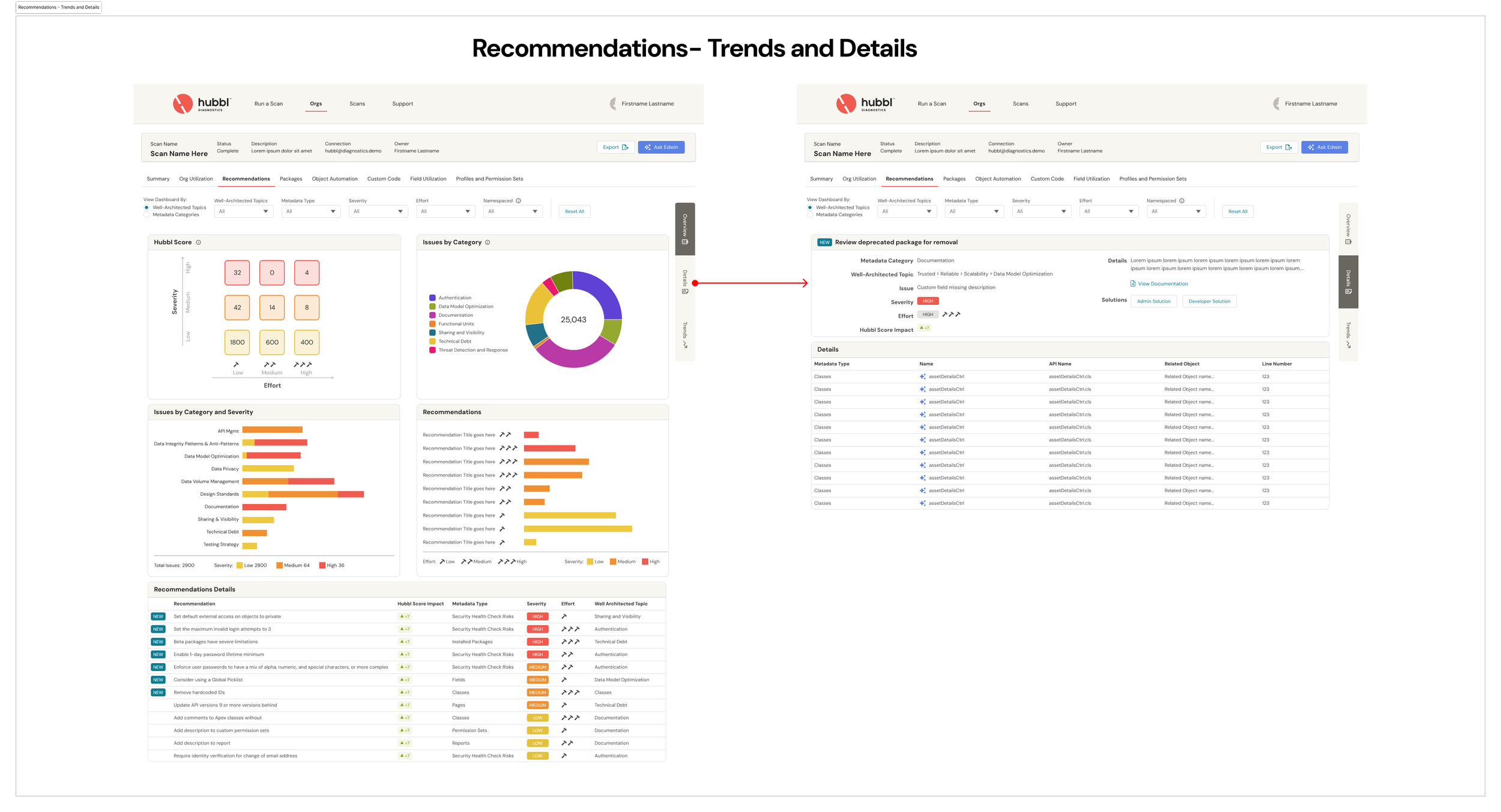
The Hubbl Action Plan is a personalized roadmap for Salesforce optimization — powered by AI and backed by deep diagnostics across metadata, automations, and process complexity. The Recommendations dashboard in the Hubbl app analyzes Salesforce org metadata to extract top risks, opportunities, and optimization areas, translating raw diagnostic data into clear, actionable fixes.
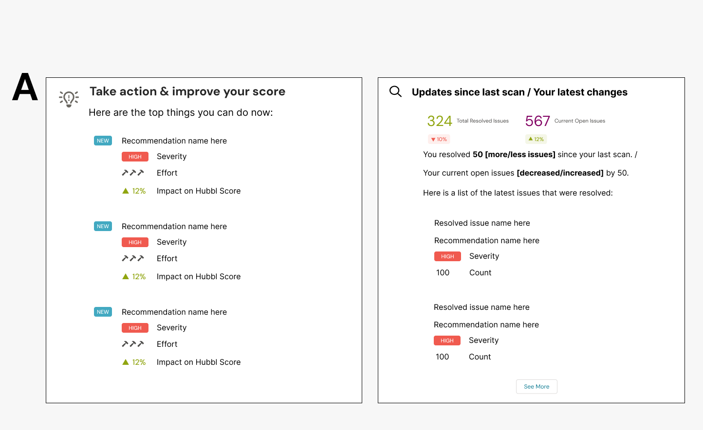
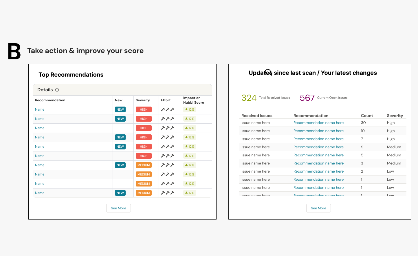
In the design, we needed to highlight:
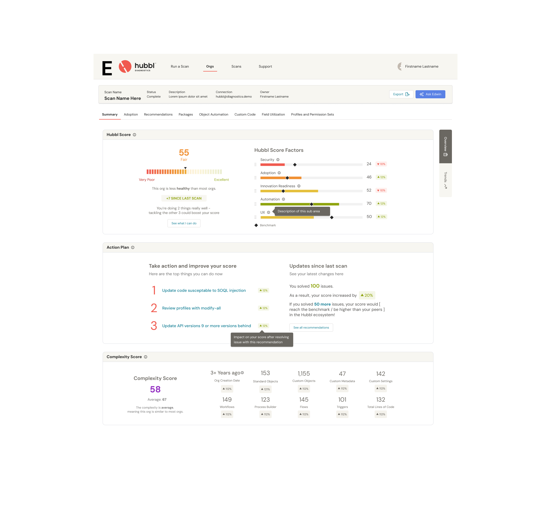
A link between recommendations and the score, by the implementing the following:
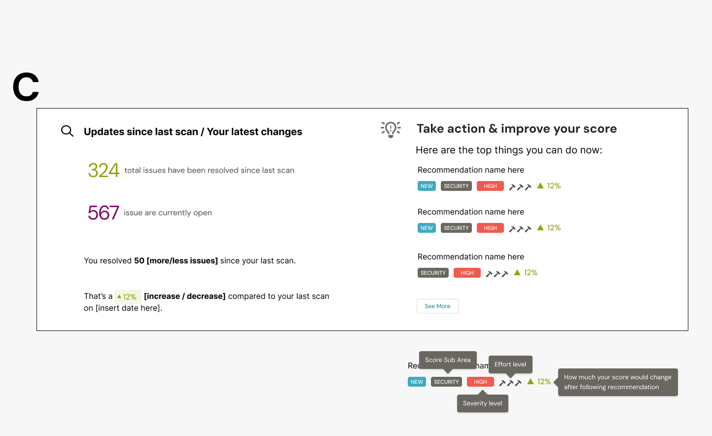
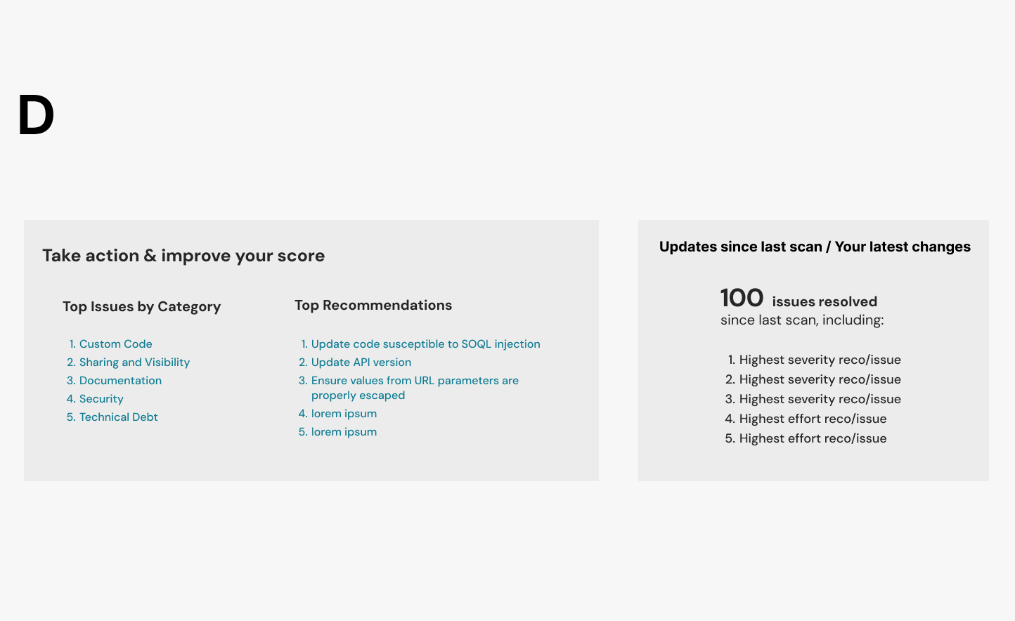
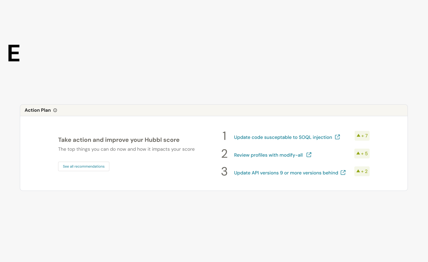
a. highlight top recommendations to increase Hubbl score (like top-3 or top-5 contributing issues)
b. place a recommendation widget on the summary page where the score lives
c. highlight how many recommendations with severity and efforts were solved from previous time
We needed to make the recommendations more engaging (i.e., not passive lists). We want it to show users the top 3-5 things they should do right now and how they would improve my org's health, as well as show a summary of what changed in the most recent scan. And displaying the recommendations as paragraphs rather than list views/tables.
Dashboard Layout
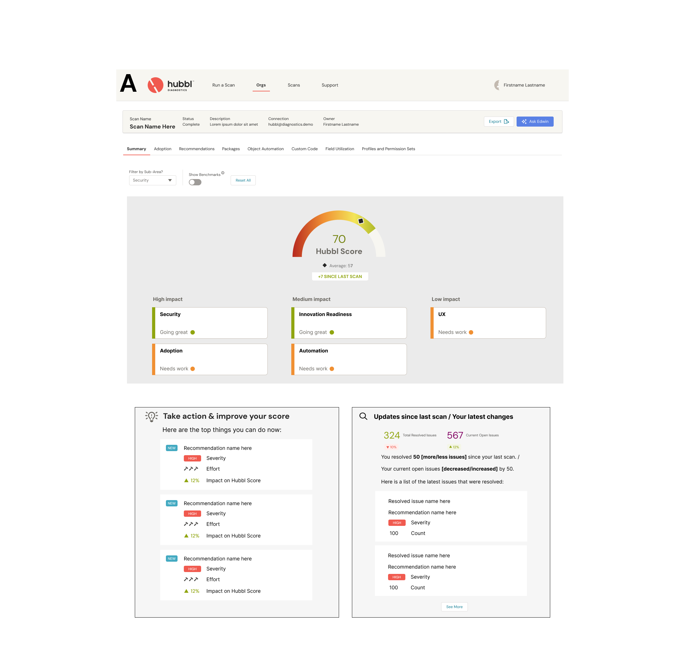
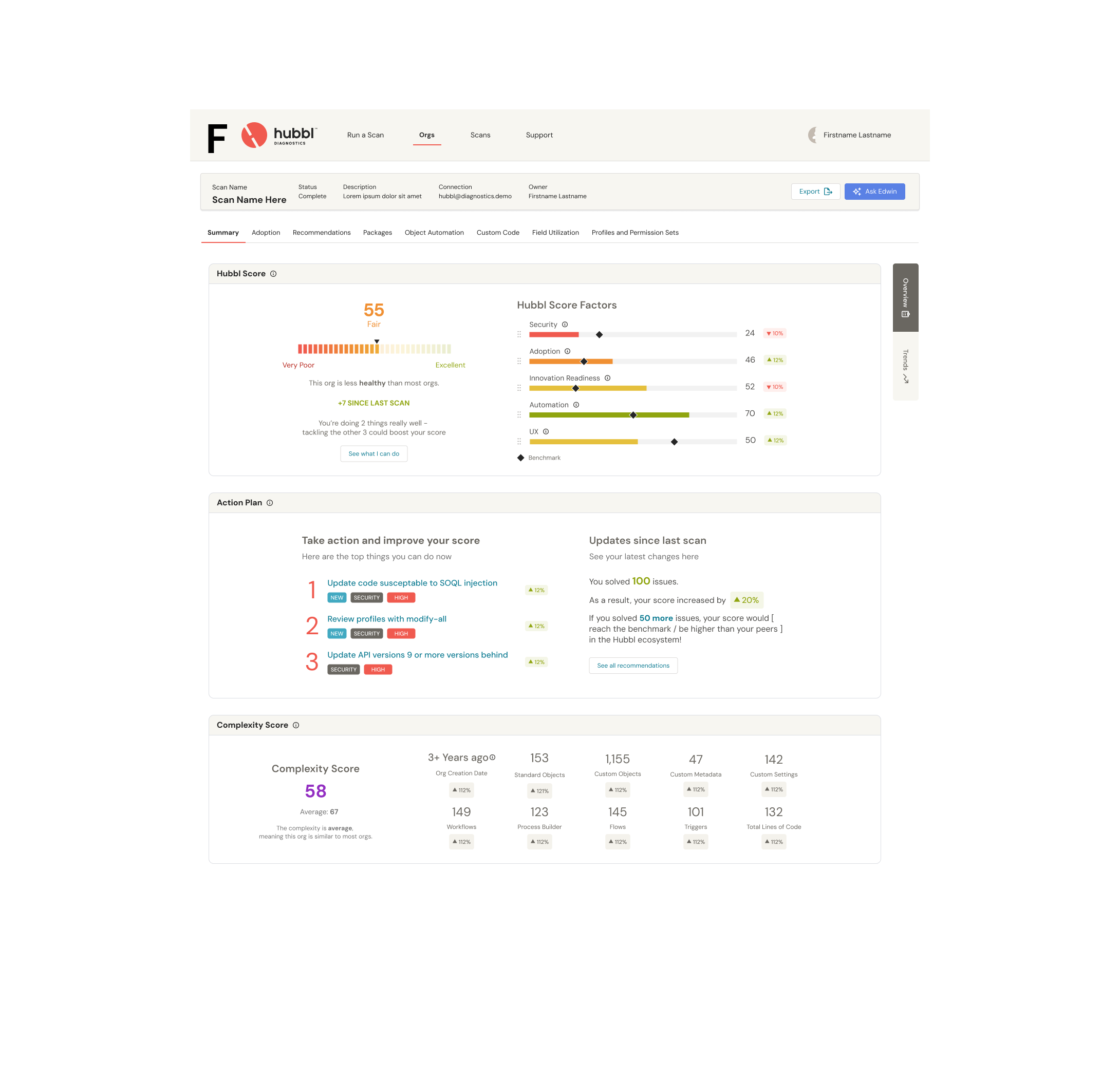
Zooming out, it’s important to see all the widgets together and see if they work cohesively on one dashboard. Many iterations were made to the summary dashboard to prevent overcrowding or data or overwhelming view of the org. We drastically simplified the home summary dashboard to give users a better focus on understanding the state of their org and straight to the point on what to do next.
THE SOLUTION
Final Designs & Impact (The Resolution)
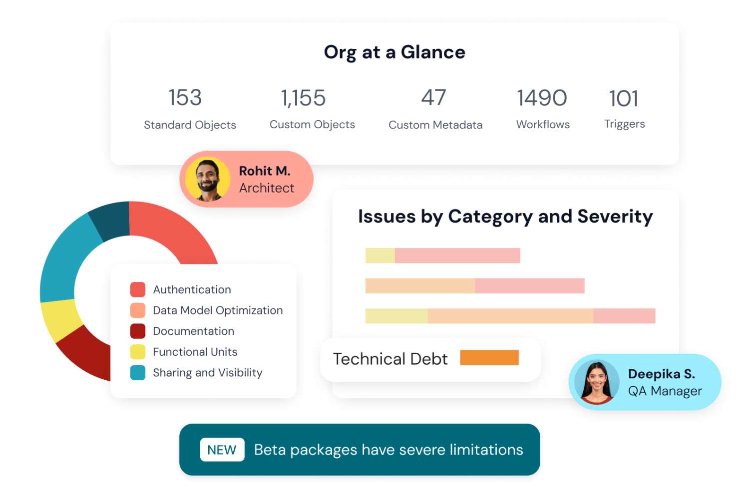
The Hubbl Org Health Score provides a comprehensive evaluation of the user’s org health, including a score, a grade, and a detailed breakdown.
The score considers two main factors: the severity of the issues found (high, medium, or low) and your org size (the amount of metadata). High-severity issues undergo a logarithmic transformation that heavily penalizes their presence, while medium and low-severity issues are treated differently, with varying degrees of impact on the score. It also accounts for the ratio of number of issues which exist to total number of metadata, which help to make the score relevant to different org sizes.
A low Hubbl Score indicates that there are significant issues within your Salesforce. It suggests that there's a need for immediate remediation to improve the health and performance of the org. A high Hubbl Score indicates that your Salesforce has fewer issues, is well-maintained and secure. However, even with a high score, continuous monitoring and improvement are still necessary.
Problem
When org complexity goes unmanaged, organizations face degraded system performance, poor user adoption, lost ROI, delayed timelines, and hundreds of lost hours spent manually auditing metadata.
High Noise, Low Clarity: Native tools fail to prioritize issues, forcing teams to rely on guesswork, circular discussions, and manual audits that take weeks to complete.
Accumulating Technical Debt: Without clear guidance on what to fix first, technical debt grows, timelines slip, and performance degrades.
Static Audits: Traditional org audits offer only a one-time snapshot, quickly becoming outdated as the system evolves.
Solution: The Hubbl Action Plan & Hubbl Score
An automated, AI-powered diagnostic feature that translates complex metadata into a dynamic, prioritized roadmap for Salesforce optimization.
Automated Prioritization (Hubbl Score): Evaluates metadata against the Salesforce Well-Architected Framework to generate a diagnostic score, instantly identifying broken components, their root causes, and their impact on ROI.
Living Strategy Engine: Features continuous monitoring and issue lifecycle tracking (discovery to resolution) across recurring scans, replacing static reports with actionable progress tracking.
Shared Ecosystem Language: Standardizes health, design readiness, and adoption metrics into clear executive-level visual dashboards for cross-functional alignment.
Outcome & Impact
Drastic Time Savings: Replaces hundreds of manual audit hours with instant, automated insights aligned with industry standards.
Accelerated Time-to-Value: Enables faster deployment of new features (like Agentforce) by removing hidden architectural blockers quickly.
Cross-Team Alignment: Replaces circular debates with a single, shared baseline for technical health across product owners, developers, consultants, and executives.
Sustainable Org Health: Transforms sporadic troubleshooting into continuous, measurable improvements in system performance, adoption, and overall ROI.